Saturday, April 14, 2012

The Many Uses of the Mermaid


In keeping with one of the evolving themes of this blog, images as iconography, this post is devoted to the mermaid, its origins and significance, and the many uses for the figure that have been devised. Before or after reading this piece, log on to eBay and search “mermaid.” Checking in there regularly I find no fewer than 57,000 entries of mermaid-related items on auction.

That is a rather astounding number but then the mermaid has an impressive history. The first known mermaid stories appeared in Assyria about 1000 B.C. The goddess Atargatis loved a mortal shepherd and killed him by accident. So bereaved, she jumped into a lake to become a fish but was, so the story goes, was so beautiful that the waters would not mask her face or breasts. As a result she was human above the waist, a fish below -- and lo! the mermaid was born. Similar stories appear in the mythology of Greece, Syria, Arabia, China, India, Scotland and England.

One influential image was created by British artist John William Waterhouse in the late 1800s. Entitled “A Mermaid,” is an example of late British Academy style artwork. The painting, shown here, debuted to considerable acclaim (and secured Waterhouse's place as a member of the Royal Academy). It is currently in the collection of the Royal Academy in London. Waterhouse has captured a romantic, enduring image of this mythical creature.

But as occurs so frequently, human nature seems to demand that we find other -- often practical -- uses for our icons. The artifact that launched me on this post was a cast iron brown mermaid with a bulbous nose and both arms raised high. As it turns out, she is a bootjack, a device for that uses her V-shaped arms to help extract someone’s foot from a boot. She is purely utilitarian and a far cry from the beauty in Waterhouse’s painting.

The bootjack mermaid, like Waterhouse’s, has bare breasts. This anatomical reality has caused a problem for those using the mermaid for practical purposes. The frontal nudity has draw criticism from persons made uncomfortable by the unclothed female figure. Thus a number of strategies have been devised to deal a more modest mermaid. The bottle opener shown here is an example of one solution: crossed arms. Another ploy, one used frequently in the movies, is the mermaid’s hair streaming over her bosom. Witness a door knocker where the visitor is greeted with a welcome sign and a chance to grab the knocker.

A third way of covering up the lass is to give her a C-cup in seashells. This is demonstrated by a waving mermaid, flanked by a leaping porpoise and a lighthouse. Is she urging sailors onto the rocks to their doom? No, she really is part of a metal plate meant to disguise a hose reel. Some artifacts have gone so far as to put the fishy lady in swimming togs. Shown here is a metal coin bank mermaid-style. She appears to be wearing a two-piece bathing suit and a matching cap. Even more modestly dressed is the wide-eyed, blonde haired mermaid. Believe it or not, she is a pencil sharpener.

It is not hard to get a handle on the next mermaid. She IS a handle and appears to be wearing a bathing suit as she anchors a cup on a maritime saucer. Note that her tail is double and a variant on the usual fin. Another artistic effort, this one by glass artist, Milan Townsend, transmutes the mermaid into a bottle. Her human half makes up the stopper, while the fishy part is the actual container. Here too the artist has taken liberties with the usual image by including porpoise-like flippers as well as a cleft tail.

The last figure shown here uses the classic shape of the mermaid, bare breasts and all, but colors her hair red, body green, and inserts one nasty looking hook from her naval and another from her tail. My Dad always said there were fishing lures meant to catch fishermen rather than fish. This clearly is one of them. It provides another example of the many uses of the mermaid. If space permitted, I could have included images of mermaids as finger rings, fountains,vases, tattoos, and a dozen other uses. Clearly the notion of the half woman, half fish, conceived first in antiquity, has a continuing fascination in contemporary culture. That helps explain those 57,000 plus items for sale every day on eBay.


.

Sunday, April 1, 2012

Mormon Invigorators


With the likelihood that Mitt Romney will be the Republican candidate for President, increasing attention is being paid to his Mormon religious affiliation. One topic that will not likely come up is that of “Mormon Invigorators.” These invigorants had nothing to do with the Church of the Latter Day Saints and a lot to do with sleazy nostrum peddlers who saw a market for their quack medicines in the polygamous marriages that many early Mormons practiced.

Shown here is a picture of Brigham Young, famous leader in the Mormon church, surrounded by pictures of 21 of his wives. He also fathered at least 56 children. To many Americans of the late 18th Century, Young and other Mormons seemed the epitome of sexual vigor even into old age. Quick to pick up the scent of fast buck, a few druggists of the times linked the Mormons to remedies that were supposed to restore libido and provide a more active conjugal life.

Some linked their nostrums to a shrub named “tumera diffusa,” more popularly known as damiana. Traditionally reputed as an aphrodisiac, damiana had attracted the attention of the medical fraternity and commercial houses as early as 1870. It often was sold in bottles with semi-nude women and sometimes satyrs scampering around the label. Merchandised as the Mormon Elders Damiana Wafers, however, the advertising took a different tack. As shown here, one ad featured older gentlemen peering at the sign, apparently wondering if the wafers would be of use to them. Another showed an elderly man, clearly with lascivious thoughts in mind, grappling with a nubile lass who seems delighted that old age is catching up to her.

Other ads emphasized the idea that the Mormon Elder wafers would bring the light and joy of small children into one’s life as the invigorator took hold. As shown here, one shows a sprightly gent, obviously high on wafers, cavorting with his wife and new babe. The caption reads: “There is something back of this.” Below is provided the all too obvious answer: the Mormon wafer. A second baby is shown twirling a drum with the remedy’s initials. The text assures that the wafers permanently restores those weakened by early indiscretions, imparts youthful vigor, and is a positive cure for (note all caps) IMPOTENCY.

The Mormon Elders Damiana Wafers were the brainchild of a New York druggist named F.B. Crouch, who did business at 202 Grand Street in the Big Apple. He also boasted a London outlet at 51 Strand. While Crouch could be coy and indirect in his advertising, he resorted from time to time to the traditional methods of selling aphrodisiacs, by featuring a nude. She may have gotten one of his London dealers in hot water with authorities. In 1893, one John James Blissett Hay of Wellington Street, Covent Garden, was summoned to Bow Street Police Court for exhibiting indecent advertising cards promoting damiana wafers in his shop window. The full product name was not mentioned in the police report, but we can speculate it was Crouch’s naked lady who offended the sensibilities of a passing bobby. Because Hay took the advertisements down as soon as he was cited, his fine was only 20 shillings.

Crouch’s Mormon Elder wafers seem have enjoyed considerable success. They came in both pink and white, and sold for a pricey $1.00 and $2.00 a box. Crouch advertised them for almost two decades, into the 1900s. Sometimes he took full page ads that featured a Victorian couple seemingly on the verge of coupling. With this image frequently was included a passage from “The Mission Elders Book,” obviously a play on the Book of Mormon. The quote read: "At a certain time of life certain things cease to interest but about somethings when we cease to care, what will be the use of life, sight, or hearing?" Food -- and wafers -- for thought.

In a trade circular of 1888, the New York druggist explained how the remedy worked:
“Actually creates new Nervous Fluid and Brain Matter by supplying the Blood with VEGETABLE PHOSPHATES, its Electric Life Element, the very core and center of the Brain itself—Restoring the fullest and most Vigorous conditions of Robust Health of Body and Mind, so that all the Duties of Life may be pursued with Confidence and Pleasure, and whilst pleasant to the taste never fails to Purify and Enrich the Blood, and thoroughly invigorate the Brain, Nerves, and Muscles. Its energizing effects are shown from the first day of its administration by a remarkable Increase of Nerve and Intellectual Power, with a Feeling of Courage, Strength and Comfort, to which the Patient has long been unaccustomed.”

If sexual incapacity was not your problem, never mind, you might still be a customer for Mormon Elder Damiana Wafers. The product also was recommended as an infallible remedy for malaria, flatuency, and “nervous dyspepsia,” as well as an antidote for people with a craving for tobacco and alcoholic stimulants. Crouch also sold Mormon Elders’ Attraction, Mormon Elders’ Complexion, and Mormon Elders’ Laxative Fruit Wafers, all with ingredients undisclosed.

If you became disillusioned with the Mormon Elders invigorator but still lusted after Mormon virility, you could purchase for the same purpose from other vendors Mormon Bishop Pills or Brigham Young Tablets. When tested by federal authorities under the Pure Food and Drug Act, Brigham Young Tablets were found to be composed mostly of sugar. Because Mormon labeled nostrums generally were sold by mail, the Feds could crack down on false labeling and eventually ended their sales.

The government did not have had any jurisdiction to investigate the “Mormon Elder Suspensory Bandage.” Advertising material featured the illustration of one well-dressed man handing another a “confidential” package -- one guess, a suspensory bandage! The accompanying text suggests that the device helped guard against injury and disabilities. It came in three sizes: small, medium and large and two qualities, $1 or $2. The description reads like a prototype jock strap. I suppose “large” was the most favored size.

If there is any moral to be drawn here it is that either polygamy was abolished too early or Viagra invented too late. From the looks of the 21 wives of Brigham Young, he may well have yearned for an “invigorator” from time to time.

Saturday, March 17, 2012

Bock Beer: Getting Our Goat One More Time


My post last year about this time celebrated bock beer. The origins of bock beer are quite fuzzy. Apparently back in medieval days German monasteries would brew a strong beer for sustenance during their Lenten fasts. A prevailing myth during my boyhood was that bock was a bottom fermenting lager that was created when breweries cleaned out their vats during a Spring cleaning. That apparently was a myth. Whatever its origins, bock beer has traditionally been advertised with goats, as noted last year.

The earlier post featured pre-prohibition images of the goat. This one begins in that era and then shows the goat images as they have evolved to our own day. The first image shows a German beer maid riding a goat. The Hell Gate Brewery was established by George Ehret, a German immigrant, in 1866. By 1900 he had increased production to 601,000 barrels a year and his became a major East Coast Brewery. When Ehret died in 1927 his estate was estimated at $40 million.

Because the goat was also identified with sexuality, bock ads frequently show Billy cavorting with a female, usually fully clothed but sometime, as shown here, in a state of undress. In this case the goat seems more surprised and alarmed by being grasped by the auburn-headed beauty.

A happier goat is the focus of a 1908 Narragansett Bock ad as it appeared in the Pawtucket R.I. Evening Times. The legend written on his side says, “Who wouldn’t be a goat?,” especially with a beer stein in hand. This brewery was founded in 1888 and at one time, the grounds of the Narragansett Brewing Company reportedly included a barn, a stable, a blacksmith, seventy-five horses, forty-five wagons, gas-powered trucks, electric trucks, twenty-five refrigerated train cars and its own ice plant. No mention of a goat pen.

The Clausen-Flanagan name was appended to a New York City brewery located at 262 10th Avenue and 450 26th Street from 1908 to 1915. Founded in 1860, the brewery had had a number of earlier company designations, including James Flanagan & F. Wallace Columbian Brewery (1874-1881) and Flanagan, Nay & Co. (1888-1908). The plant closed with Prohibition.

The next ad for bock beer shows a goat with a slightly crazed look in its eyes. It appears to be chewing a plant, presumably hops, but given the goat’s demeanor, it might be hashish.
The Cassville Brewery goat, by contrast, has a distinctly hung over look. Furnace Branch Creek Hollow in Wisconsin, so named because of the lead smelting operation it once contained, was the site of the Cassville Brewery. For many years Cassville boasted of its fine bottled beer and produced numerous cases for sale throughout the area. Today it's the labels and bottles that are hunted for and prized by collectors. The brewery ceased operation in 1938 and the buildings were later demolished.

One of my favorite bock goats was the product of the the Pabst Brewing Company of Milwaukee. The logo above the goat indicates that this is a pre-Prohibition framed sign. It would have been provided by the brewery, probably on a seasonal basis, for the walls of saloons featuring its beer,

Moving beyond the Prohibition era, the next goat image is from Germany where such animals regularly were decorated for Spring festivals. This one comes rolling in on a barrel from Lowen-Brau Brewery of Munich. The goat looks less than happy about its situation. A happier goat is the lip-licking goat. Unlike most of the herd, this one is just a kid amidst “the old goats.” The Acme Brewery of San Francisco was erected after the earthquake of 1906, as a branch of Leopold Schmidt's Olympia Brewing Co. The aftermath of the quake left the city with few operating breweries, and as a result a $1,000,000 order was placed with Schmidt's Bellingham Bay Brewery (and probably a like order with Olympia) for beer to be shipped to the city. Acme went out of business in 1954.

Another modern version of the traditional goat is from on the Columbus Brewing Company, one of the first brew pubs in Ohio. Founded in 1988, it is located adjacent to German Village in the historic Brewery District. Its goat has gone cubist and “tres moderne.”

There they are: Ten more bock goats, dating from the early 1900s to the late 1980s. These are just a few of the thousands of different depiction's of the beer-drinking ungulates that have been featured worldwide for centuries.

Friday, March 2, 2012

Celebrating the Clapsaddle Irish


In commemorating St. Patrick’s Day for the past two years, this blog has been devoted to 19th Century racist images of the Irish (March 2010) and to the gradual changes in their depiction that occurred from the 19th into the 20th Century (March 2011). This year the focus is on one woman, not Irish, who did more than anyone to provide a dignified and salutary image to Americans of the Irish heritage. She also can be credited with popularizing the St. Patrick's Day greeting card. Her name was an unusual one: Ellen Hattie Clapsaddle.

Clapsaddle was born as the Civil War was ending in 1865 in the small farming community of South Columbia, Herkimer County, New York, the child of Dennis and Harriet Clapsaddle. She shown here in her graduation picture from the Richfield Academy in Richfield Springs, New York. The little girl who looks out at us is shy and fragile. Her juvenile signature bears little resemblance to the “Ellen Clapsaddle” that she added to her art work. She subsequently went to college at the Cooper-Union in New York City and was one of its first women graduates.

Ellen was drawn to art from an early age. Until she was in her early 20’s she painted local farmhouses, homes and portraits in watercolor. She also decorated china plates and did worked for a Utica publishing company. During this time she sent two of her postcard designs to a New York City publisher who immediately liked her artwork and contracted with her for more. Her cards became an instant success.

During her lifetime Ellen Clapsaddle created more than 4,000 images of children and published some three million postcards and greetings containing children. She is credited with putting the first smile and rosy red cheeks on Kris Kringle and beginning his transition to modern day Santa Claus. Just as important for the purposes of this post, she pioneered in the creation of the St. Patrick’s Day card. In so doing, she was making giant strides in improving the image of the Irish in America.

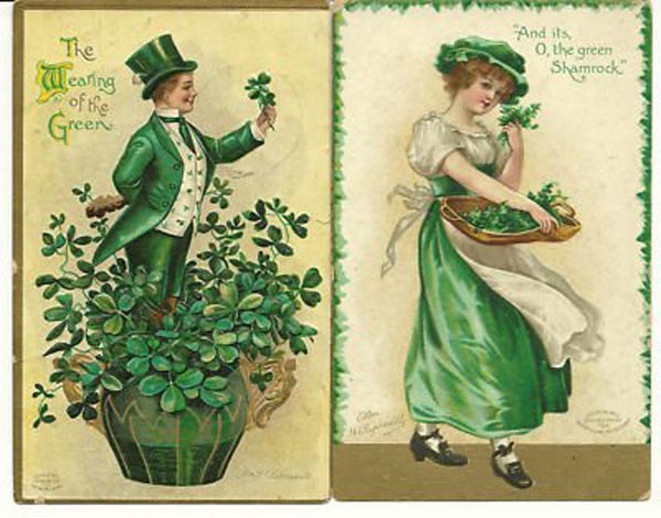
In the past Irish-American children frequently had been portrayed as ill-clothed, dirty and ruffians. Clapsaddle, as shown here, dressed them as little gentlemen and ladies with top hats and bonnets. A particular favorite image of mine are the Irish children floating along on a large green balloon and the salutation, “Top of the morning to you.” She repeated the little gentleman and lady themes on a number of St. Patrick’s Day postcards. Occasionally, and brilliantly, she sometimes strayed from romantic views to give us the portraits of four Irish kids just being kids -- still an endearing picture. Ellen never married and, sadly, had no children of her own.

Clapsaddle also had the ability to paint beautiful women and make them Irish, as shown in the next two postcards. Earlier artists and cartoonists often had pictured mature Irish women as overweight hags or slatterns. Her depiction's help to change all that, as did the increasing economic well-being of the American-Irish population. Her depiction of the older Irish men also was respectful, too often depicted earlier as bomb-throwing thugs. The gentleman shown here with pipe and hat is well groomed, gentlemanly and obviously benign.

The final postcard included here demonstrates Clapsaddle’s continuing ability to paint landscapes, in this case of Ireland. I can find no reference to indicate that she ever visited the Auld Sod, even though she made frequent trips to Europe. The Germans had perfected a four-color printing process that was far ahead of that in the U.S. and she traveled there frequently to supervise the printing of her cards.

Her last trip to Europe proved her undoing. She was in Germany working with an engraving company when World War One broke out and she was unable to return to the United States. The strain of being held in wartime Germany told on both her physical and mental health. After the war she was found wandering the streets of a German town, with no money, hungry and confused.

Brought back to the United States through the generosity of a former employer, she was admitted to the Peabody Home for the elderly and destitute in New York City where she died in 1932, one day short of her 69th birthday. She is buried next to her parents in Lawnview Cemetery. Her grave marker simply reads, “ELLEN.”

The last, and only second known, picture of her is shown here. Compare it to the graduation photo. The eyes that look at us now are injured and sad. For a woman who has given so much joy and pleasure to millions through her artistry, there was only bleakness and despair. Ellen Clappsaddle did not deserve her fate.

Certainly the products of her talented hand have fared better than she did; her cards are avidly collected and preserved by thousands of adherents. Those of us who boast of Irish descent should raise a glass on March 17th to the memory of a woman named Clapsaddle who as much as anyone changed the image of the Irish in America while helping making St. Patrick’s Day a national celebration.

Saturday, February 18, 2012

Ways of Seeing: "His Master's Voice"


Few advertising images were more recognizable during the 20th Century than the picture of a small dog sitting in front of a vintage record player, called a Victrola. It was entitled “His Master’s Voice.” As has been noted with such familiar merchandising icons, the tendency over time is to parody them widely. So it has been with “His Master’s Voice.”

Some parts of the story behind the image are well known. The dog was a stray found in Bristol, England, in 1884. He was named “Nipper,” because of his tendency to bite unwary visitors on the backs of their legs. Nipper was adopted by a British artist named Francis Barraud, shown here, who noticed the dog curious about his gramophone, apparently trying to figure out where the voice was coming from.

Three years after Nipper died Barraud, working from memory, put the scene on canvas, completing it in 1899. The artist tried to exhibit the painting at the Royal Academy but was turned down. He had similar luck peddling it to British magazines. Barraud then went commercial, offering it to the Edison Bell Company. They also rejected it. Perhaps as a last resort, he visited a newly formed gramophone company with a photograph of the painting. The ownership liked it and offered to buy it if Barraud would substitute their machine for the Edison.

Barraud agreed, repainted it, and only a few months later the Berliner Company had patented the image in the United States for its gramophone. Eventually the trademark was passed on to the Victor Talking Machine Co., maker of the Victrola. That firm extended the trademark throughout Central and South America, Japan and the Far East. In the U.S. the Nipper logo appeared on the Victor machines, letterheads, record catalogs, record labels and all company literature. Even after Victor’s merger with RCA in 1929, “His Master’s Voice” persisted in company merchandising until well after World War II. It must be counted as one of the world’s most successful and lasting merchandising images.

Few could resist a parody on “His Master’s Voice,” including Walt Disney. His studio drew Pluto, always an engaging cartoon figure, eagerly listening to the gramophone. Political cartoonists also found it provided a handy image for depicting political figures taking orders from afar. The first cartoon shown here from 1941 is of Marshall Petain, the Nazi figurehead of Vichy, France, who had surrender much of his country to the Nazi regime in Germany, indicated by the swastikas on the phonograph. Lester Pearson was the prime minister of Canada from 1963 to 1967. Here he is caricatured listening intently to the voice of the United States, at least in the view of the Canadian unions who sponsored the cartoon.

My favorite spoofs of the Nipper logo are connected to the whiskey trade. “Old Tucker
Whiskey” was a lead brand of the Brown-Foreman Company in the pre-Prohibition era. This Louisville, Kentucky, outfit was formed by George Brown and George Foreman in 1891 and has survived to the present day. It chose the image as the back of a pre-Prohibition celluloid pocket mirror. Note that the gramophone has been replaced by a whiskey jug and the horn by a funnel. The bulldog “Suspects His Master.”

The post card following has a similar motif, a dog -- this one looking a lot more like Nipper -- sits in front of a whiskey container, smelling a funnel. This is “His Master’s Vice,” a play on the slogan by the forces of Temperance. Another postcard in this genre depicts a puppy sitting in front of a funnel. The jug has disappeared but the canine still recognizes “His Master’s Breath.” The final example is a mini-jug with an underglaze illustration of a large dog sniffing a whiskey jug. Again the pooch is said to be smelling “His Master’s Breath.”

In gathering images for this article, I found at least a dozen or more parodies of the Nipper logo, some dating from early in the last Century, some more recently created. The proliferation is testimony to the permanence of the original Barraud image. The artist himself died at the age of 69 in August, 1924. He painted some 24 copies of his most famous work, all of which found a ready market. Perhaps in a unwise move, however, Barraud sold the reproduction rights to the Nipper image for 100 British pounds.

Friday, February 3, 2012

Blacks in Whiskey Advertising III


For the past two years, my contribution to February’s Black History Month has been to discuss the historical depiction of blacks in whiskey advertising. The 2010 post focussed on a series of images to show some progression over the years as views on civil rights evolved. Last year the post featured ads depicting black waiters serving whiskey. This year I have gathered another group of images from the late 19th and early 20th centuries, several of them disturbing but nevertheless instructive.

The first is a sign that shows a black man walking down a road with a chicken under one arm and a watermelon under the other. We are expected to assume that he did not come by either honestly. He has spotted lying in the road, a bottle of Fern Glen Rye whiskey and looks at it with great interest. But he will have to lay down one or the other treasures in order to secure it. “I’se in a perdickermunt,” he says. The whiskey made by the Fern Glenn Distilling Co. of St. Louis, Missouri. The company appeared only a short time, 1916 and 1917, in local business directories, perhaps indicating ads like this did not work.

The stereotype watermelon appeared in another distiller’s ad, again involving a choice between the melon and a bottle of whiskey. The melon is held by a black woman wearing an apron; the whiskey by a bearded winking man. On the ground in front of them is a boy wearing a tattered hat who is clearly torn between one and the other. The caption is a strange one: “The Temptation of St. Anthony.” The medieval saint’s temptations were largely sexual in nature, rendering this caption ridiculous.

This image appeared on a number of signs, some like this one with a faux wood motif. It was the product of the Paul Jones Distillery. It was founded by a family who provided sons and their wealth to the Confederacy only to find after the war that their home was in ruins and they themselves were destitute. This may have been the reason for the persistent racism in Paul Jones advertising. Initially from Virginia the Jones family moved to Frankfort, Kentucky, in 1886 and eventually adopted the name, Frankfort Distillery. It was one of a favored few distilleries allowed to make medicinal whiskey during Prohibition and emerged into the Post-Pro era, where its advertising continued to demean blacks.

The next ad, for Prosperity Whiskey, was the product of the Bernheim Distillery of Louisville, Kentucky, an organization better known for its I.W. Harper Brand. The Bernheims, emigrated from Germany with little money but created one of the most successful whiskey enterprises in American history. The photographic image of a Negro wedding shown on this saloon sign is profoundly offensive even by the standards of that earlier time. Although accounted philanthropists, the Bernheims apparently were not above patently racist advertising. The next ad, showing a ragged black boy dancing to his own accompaniment is also from Bernheim. It advertises “Old Continental” whiskey. Cards like this were printed with a local saloon carrying the whiskey printed on the bottom.

The next card shows a black boy kissing a black girl with the caption: “Honey duz you love me as much as my Pa duz ‘Old Prentice Whisky?’” In the background a voice from a cabin says, “Whar dem chillun.” This brand was the product of J.T.S. Brown & Sons of Louisville
in business from 1871 to 1919. These were blenders of whiskey featuring several brands and drawing their liquor from a range of Kentucky distillery warehouses.

The Louis Petzold Company of Baltimore produced a trade card with a murky message. It shows a white youth poking his head from a globe of the Western Hemisphere while in the background a group of blacks is picking a vast field of cotton. In the foreground a side-wheeler steamship moves by. The whiskey is “Dixie” and it product said to be “for medicinal use.” Petzold, a German immigrant, is said to have started a liquor business in 1862, although his initial directory listing is 1870. The firm disappeared from listings in 1898.

Unfortunately the torn label on this “Old Mose” flask prevents identifying the merchant behind the brand. The organization also issued a shot glass advertising Old Mose but did not include other information. The next trade card shows another dancing black. This time it advertises both a whiskey (Old Crow) and a saloon (Hayes at the White House). This was a Boston-based drinking establishment that sold customers a beer for a nickel and a shot of whiskey for a dime.

The sum impression of these pre-Prohibition images is their perpetuation of racial stereotypes, their distortion of black physical features, their attribution of fractured English, and their feeble attempts at humor. As a antidote to these images, I include here a 1966 Old Taylor Bourbon ad that celebrates as an American hero, Benjamin Banneker (1731-12806), a free African American astronomer, mathematician, surveyor, almanac author and farmer. The ad celebrates in particular his role in surveying the boundaries of the District of Columbia.