At this point we return to Germany, to a very small town in Baden-Wurtemberg, not far from Heilbron, called Berg. There in 1888 a 14-year-old boy was working as a farm laborer for his mother and neighbors to put by enough money for his passage to America. His name was Heinrich Adam Lay (in German pronounced “Lie”). Later Americanized as Henry and called “Pop” by his children, he already had farmer brothers in the U.S., living in Illinois near Peoria. They were among the children of Friedrich Lay, a farmer, born in 1836 in Kreuzle, Germany. Friedrich was the son of Johann Christian Lay of Kreuzle and Rosine Schmidgall, all of this known through rigorously-kept lists in German in the Lay family Lutheran Bible.
Friedrich married twice. In 1863, he wed Jakobine Sinn who bore him two children before dying in childbirth. In 1869 he married Barbara Waldbusser, our great great-grandmother, born in 1842. She was the daughter of Friedrich Waldbusser and Katharine Schluchter and apparently a cousin of Jakobine . She bore Friedrich Lay 17 children, of whom only six would live beyond infancy. Of those, Henry was the second son, born in September, 1874. He would remember his mother fondly as a warm and caring person.
Henry was only 10 years old when his father suffered a fatal injury. Friedrich was driving a team of oxen and a wagon over a wooden bridge when it partially collapsed under the weight. He was thrown under the wagon and suffered a wound to his arm. The wound became infected with tetanus, he developed lock-jaw and died. The year was 1886 and Friedrich was only 48. Barbara never remarried. She and the children did the farm work, Henry recalled, even though she insisted the youngsters all stay in school. Like many German communities, the farmers lived in villages on the hilltops and went out by day to their fields on the slopes and in the valleys. Henry would remember the rigors of the climb and much prefer the flat land of the American Midwest. A 2003 visit to Berg, which means “mountain” in German, confirmed that the town, though small, still exists at the top of several hills, but by no stretch mountains, with fields spread out all around. Even by German standards it is a small village.
Shipwrecked and a Job
Family members believe it was Barbara who urged her son to emigrate to the United States. The specter of conscription into the Prussian military was an ever present threat for all young German males. Whatever the reason, in 1888 the very young Henry Lay left for the United States on a sailing vessel out of Antwerp, Belgium. He came alone as a third-class passenger in the lower parts of the ship where he saw rats mingle freely with the paying customers.
As the ship neared the U.S. coastline, it struck a fishing boat. Panic ensued as water began pour into the hold. The crew was uncertain how long the ship would stay up. A S.O.S. failed to rouse any immediate response and it was two days before help came. It must have been a very anxious wait. During this emergency, however, Henry was fascinated by the crew of the fishing boat who were taken aboard the larger ship. They were of African descent and Henry never before had seen dark-skinned people. Years later in a newspaper interview he said that the novelty helped him forget the danger.
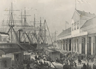
Following the rescue of the passengers by another ship, Henry landed in New York Harbor, passed by the Statue of Liberty which had been dedicated only two years earlier, and was processed through Ellis Island. He was greeted in New York City by German friends of his older half-brother, George, who already was farming in Illinois. Because Henry could not speak a word of English at that point, those friends accompanied Henry on the train as far as Peoria. George met him there with a horse and buggy and the brothers rode to Tremont, a few miles south. George arranged for Henry to work there as a “chore boy” for a well-off farmer named John Buckley.
Henry liked Buckley and his wife very much. They allowed him to go to school, helped him learn to read and write English, and treated him like one of the family. They also provided comfortable surroundings in a spacious farm dwelling. In return his job was to feed the livestock. Buckley owned several farms; sheep were kept at one site and horses at another. Henry’s chore was filling large sacks with corn and grain and carry it on horseback from place to place regardless of the weather. It was heavy work and he was not a big man but he managed. He never forgot the kindness of the Buckleys.
Enter Pauline Reger
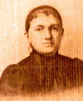 For seven years Henry Lay toiled as a farm laborer before returning to Germany in 1895 when he was 21 to visit his mother. During this visit, through a neighbor, he met Pauline Reger, our Great Grandmother, born in 1876 at Adolzfurt, a larger town not far from Berg. She was the daughter of Carl Christian Reger of Adolzfurt (1839-1918), a farmer and Lutheran evangelist. Carl’s parents are recorded as Jacob Joseph Reger (1807-1887) and Maria Grasser (1815-1880), both of Adolzfurt. Pauline’s mother was Rosine Pfisterer (1850-1918). Rosine’s parents are recorded as Georg Michael Pfisterer (1802-1857) of Weisslensburg, and Rosine Christine Kramer (1821-1878), originally of Schwollbronn. The Regers can be traced back several further generations, most of them farmers from Adolzfurt and surrounding towns.
Whether Pauline had “set her cap” for Henry at that point is unclear. She organized four of her friends to accompany her and Henry back to America. She and the others came as bonded servants, bound for a certain period of time to the family that paid for their passage, and provided with room, board and a small amount of spending money.
The trip back was made by steamer, not sail, and in second class quarters. Despite better accommodation, the trip provide a trial for Henry. By his account the five girls were hard to keep track of and kept getting lost on the large ship. In New York his problems multiplied as the they agitated to be allowed to see the sights of the big city. Even on the train trip to Peoria, Henry worried that one or more might get off to look around and be left behind. It must have been with a deep sense of relief then that the group reached Peoria and most of the girls went on to prearranged jobs in the Chicago area. Henry took Pauline to Tremont where she found employment as a housemaid until the couple were married in March 1896.
In a strange land and not speaking English very well Pauline was homesick for Germany. The Regers in Germany persuaded her sister, Karoline, to emigrate and keep her company. Karoline arrived and also was employed as a housemaid, both in Peoria and the Chicago area. With the presence of her sister Pauline settled into her role as wife and, soon, mother.
After their marriage Henry and Pauline lived on a farm owned by a man named Leonard, near Tremont. There their first four children -- Carrie, Minnie, Clara and Henry -- were born They were followed by two others, our Grandmother, Emma Margaret Lay, born in Deer Creek, Ill. in 1907, and a younger sister, Alice.
Back East to Ohio
 The Lay family story might have played out in Illinois except for a disparity in land values. Prices had skyrocketed in Illinois to more than $300 per acre but Henry Lay found that Ohio farm land was being offered for considerably less. So ignoring the national mantra to “go West” the family looked eastward. In 1908 Henry bought an 80-acre farm in Paulding Country near a hamlet called Haviland, 100 miles south of Toledo and not far from the Indiana line. The price was $115 an acre, for a total cost of $9,200.
 |
| Haviland, Ohio |
A word should be said about Paulding County, which looms large in our family story: Named for John Paulding, one of the captors of Major Andre, a British spy and co-conspirator of Benedict Arnold, the county was created in 1820 from land ceded to the white men by the Indians in the Treaty of 1818. It was settled very late because much of the region was marshy and plagued with malaria. Described as “low, wet, swampy, and heavily timbered,” even as late as the 1880s, Paulding County changed radically when a barrel-making industry grew up. Trees were harvested to make hoops and stays, and the subsequently vacant land was turned to crops.
Farming, however, was problematic because of the presence of highly unusual, widespread deposits of red clay. Formed over millennia from oxide bearing rocks and more usually found in tropical climes, this soil is known by agronomists worldwide as “Paulding laterite.” The land is not easily farmed, being rubbery when wet and rock hard when dry, which may offer a clue about why Henry Lay received an affordable price on the land.
One of Henry and Pauline’s daughters, Carrie, later remembered the train trip from Illinois to Ohio with the family, including toddler Emma. Carrie was unimpressed with the sight of her new home and surroundings. Why had their father brought them to this place? The family provisions, including their furniture, a team of horses, a cow and a dog, were loaded into a boxcar and arrived a week later in Haviland, that had a rail spur.
The new home for the Lay family had a log barn and a farm house that was an ell-shaped, seven-room white frame dwelling. It must have seemed like a dream come true for Henry and Pauline. The family had a foothold on the American dream: They were on the way to owning their own land and there was free public education in the form of a one-room school in Haviland. In good weather the children walked to school; in bad, “Pop” would hitch up the horse and take them in the family cab buggy. Education always was given strong emphasis in the Lay family.
Death of a Mother -- and After
On August 19, 1912 -- some four years after the move to Ohio -- tragedy struck the Lays. Mother Pauline, only 36 years and five months old, died. She had had gall bladder attack and the protocol of the time was to operate. The procedure took place on the kitchen table. As so often in that time, the patient succumbed. We have a copy of a memorial card that was issued for Pauline’s death. It contains this verse:
We have lost our darling mother,
She has bid us all adieu,
She had gone to live in heaven,
And her form is lost to view,
Oh, that dear one, how we loved her,
Oh, how hard to give her up,
But an angel came down for her,
And removed her from our flock.
The verse fails utterly to reflect the trauma of Pauline’s death on the family. The oldest of six children was 14, Emma was five, and Alice was still a baby Henry Lay, consumed with the backbreaking work of the farm, had a desperate need for someone to run his household and look after the youngsters. It was agreed that Pauline’s sister, Karoline, would come from Illinois to assist. Two years after her arrival in the household, she and Henry were married. They would have three more children of their own, Pauline, Lillian and Richard. Karoline would be known as “Dundy,” to family and friends, even to her own children, The name was a corruption of the German word for “aunt,” and given her by the youngest of her sister’s children, Alice.
Life on the farm was difficult even in the best of times. Paulding laterite proved fertile in when the weather was relative dry but difficult in wet seasons. Among the crops grown were sugar beets which required back-breaking work to cultivate. First the seed had to be drilled into the ground in the spring. Then the small plants were thinned in the rows, usually by hand using a short-handled hoe. Late in the fall when the beets were mature they had to be dug out by hand and the tops lopped off with a large specially constructed knife. Piles of beets then were lifted by pitchfork onto wagons where they were unloaded onto railroad cars and carried to the sugar factory in the nearby town of Paulding.
 |
| The farm, early 1920s |
Much of what the farm produced was for home consumption. The family grew all its own fruits and vegetables. Its cows, pigs and chickens produced all the milk, butter, cheese and meat for the dinner table. There was no electricity and consequently no refrigeration, so that preservation of food became a major occupation. Fruits and vegetables were canned or stored in a “root cellar,” a earthen floored pit dug inside the house and accessible by a ladder. In the root cellar produce such as potatoes, cabbage, and apples were buried under mounds of dirt and straw. In winter, as food was needed, the mounds were uncovered and items removed for consumption. Some meats were canned, others salted and smoked for preservation.
Farm life held few nostalgic images for the Lays, mostly just memories of unremitting hard work.
*****************

 In 1885, together with other Wellsburg investors in that Ohio River town, Lobmiller founded the Venture Glass Works shown below. According to an 1886 newspaper account. the glassworks specialties were brown flint glassware and private mold work. The article praised the operation: “These works are operated with natural gas, and while the establishment is not quite so large as some others, the work turned out is equal to those of more metropolitan pretensions.”
 Two years later, on August 18, 1903, the U.S, Government issued Lobmiller his patent. There was an immediate interest in the invention from a source that Lobmiller may or may not have had in mind. Although his illustrations show small marbles in the cavity, whiskey dealers and saloonkeepers saw the open space as perfect for holding bar dice.


%20PW.jpg-ACR.jpg)