Saturday, July 20, 2013

Braque and His Bottles: An Appreciation

I was introduced to the art of George Braque, the famous and influential French painter,  in 1962 during my first months living and working in Washington DC.  The Phillips Gallery has a collection of twelve Braque paintings and a friend took me to see them.  I have been hooked ever since on Braque, shown here at his Paris studio.

Now, more than 50 years after my first visit, the Phillips has a current exhibition called “George Braque and the Cubist Still Life, 1928-49,” bringing together 44 of his best works.  The catalog points out that the exhibit shows “Braque’s interest in conveying in the physicality of objects and surrounding space.”  As the title of this blog indicates,  my interest has been in the “physicality” of bottles and other glass and ceramic objects.   As I result I particularly looked for those in Braque’s still life paintings.  Here through the miracle of the computer,  I can exhibit six paintings and focus on bottles.

The first painting shown here is called “The Round Table,” which Braque produced in  1929.  Part of the Phillips Gallery collection,  it is one of the works that first lured me to the artist.  There is a bottle in the still life,  shown here in detail.  Flattened as he presented it,  it looks to me to be a container for an alcoholic beverage.  It is a darkened glass with a colored label, not unlike some American whiskey liquor containers.  Although it is a secondary element compared to the guitar at left,  it helps to tie together the disparate component parts of this excellent still life.

Following up is a 1937 Braque painting that comes from the collection of the art museum at Washington University in St. Louis, Missouri.  I had never  seen it before but was struck immediately by the elegant simplicity of the treatment:   Three oysters on a plate, a piece of lemon,  a baguette of French bread, and, ta da, a bottle.  As shown in detail, it clearly is a carafe or decanter.   Braque has rendered it in Cubist style with lots of unexplained curves and dips,  and he appears to have filled it with a pale white wine.  Beyond it sits a chair where the owner of the oysters will soon appear to unroll the napkin, squeeze the lemon, break the bread, find a glass and pour the wine from the carafe, and -- at last -- eat the oysters.

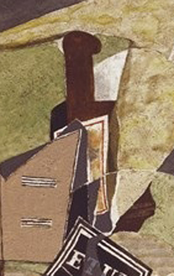
The third Braque still life featured here bears the name “Mandolin and Score (The Banjo)” painted in 1941 and currently in the collection of a New York couple.  I am puzzled by the title since the musical instrument shown in the typical collapsed Cubist style seem more like a mandolin and not much like a banjo.  But I am not confused by the bottle, shown in detail here, that sits off to the left just in front of a ceramic cup.  It is a wine bottle and from the look of the shape particularly neck and lip,  made of glass.   Once again Braque has flattened it out but used its dark shade to complement the blacks at the right side of the picture.

On other Braque still life paintings in the Phillips exhibition I have not singled out the glass or ceramic objects.  But sometimes the artist himself did.  The next painting is called “Studio with Black Vase.”   In addition to his artist’s palette,  Braque shows some of the paintings he has on his walls and finishes it off by displaying a black vase in the right hand side of the picture.   I am unable to decide if it  is glass or ceramic,  but it neatly compliments the curved elements at the left.  The painting dates to 1938.

That brings us to a 1942 painting, done by Braque in the midst of World War II, that emits nothing but peace and serenity.  It is called “Large Interior with Palette.” It is part of the Menil Collection in Houston, Texas, which might almost make a trip there worthwhile.  It has two element of note.  On the top right is a goblet.  I am guessing ceramic with a painted design. At its left is a flower pot,  clearly a plain redware container for a substantial looking plant.  The balance of this composition is outstanding and Braque has stuck his working utensils into the frame for our edification.


Braque got simpler in his compositions the longer he painted. In the final picture shown here the jumble of items has been reduced to a few, principally a fish, some lemons, a candle stick and a large glass pitcher containing, perhaps, lemonade.  The wall behind and its decoration have become a larger and more dominant part of the picture.  It is entitled, “Pitcher, Candlestick, Black Fish.”  Braque was living in Varengeville in Normandy when the Germans invaded France in 1940.  During the German occupation, Braque lived and worked in Paris where he painted this still life in 1943.  It too is in the Menil Collection.

Braque returned to Varengeville after the liberation of Paris in 1944. He continued to work through the 1940s and 1950s and was much honored in his lifetime. In 1951 he was awarded the Légion d’Honneur, and in 1961 he was the first living artist given an exhibition at the Louvre. When Braque died at age 81 on August 31, 1963, funeral services were held in front of the Louvre.

As a Braque enthusiast,  I found the current exhibition at the Phillips Gallery to be an extraordinarily positive experience.    During my tour of the galleries, a young art student who was acting as guard on the paintings,  asked me why I was so attracted to Braque.  The question took me a while to answer.   My eventual response was that the melding of shapes and colors that he achieved in his still lives was totally remarkable.  While many in the genre are stiff, lifeless and dull,  Braque’s paintings have a engaging vitality born of his ability to make a flat surface come alive through color and line.  And then, of course, there was his propensity for painting bottles....


Friday, July 5, 2013

Risque Whiskey III: From Suggestive to Explicit

From the number of hits that each post has received,  my previous two expositions of racy whiskey ads and illustrations from the pre-Prohibition past have been crowd pleasers.  Having collected a substantial numbers of images since my last similar post in July 2012, I am herein providing a new installment.   These whiskey advertisements range from the merely suggestive to being, well, downright explicit in their content.

Starting with the most innocent, but by current standards no way politically correct, is a trade card touting Gold Grain Whiskey from the Buffalo Distilling Company.  It shows an African-American gentlemen,  presumably blind, ogling a damsel who is lifting her voluminous skirt to fix her stocking.   In one image this ad manages to give offense to African-Americans,  the sight impaired,  feminists, and for good measure, the Prohibitionist crowd.  But at the time the Buffalo Distilling Company thought the illustration was a good way to sell whiskey. Times change.  This firm first shows up in Buffalo,  New York,  directories in 1895.  Likely blenders of other distillers’ product, it featured a blizzard of brand names.  Prohibition killed this Buffalo liquor business in 1918.

The saloon sign that follows dramatized a somewhat different story.  A young man has found his way into a house of ill repute and is romancing one of the ladies of the establishment, both drinking whiskey.  He has been discovered by his top-hatted father or guardian who is pulling Romeo’s ear and tearing him away from a highly amused doxie.   If we could read the label on the whiskey bottle and the crate on the floor,  we would find that the liquor being advertised is “Blue Star Monogram Whiskey,”  the product of Solomon Bloch of Cleveland, Ohio.  Members of the Bloch family were involved in the liquor business in Cleveland from 1869 until about 1902.

We are still inside that bawdy house in the next saloon sign.  Two women in scanty gowns are partaking in shot glasses of Wilson Whiskey.  They clearly are waiting for the customers of the evening and imbibing, as the legend says, “A Nightcap of Wilson.”  A large bottle of whiskey resides on a table,  clearly ready for the party to begin.   Although a discreet depiction of the erotic, it is nonetheless surprising because this sign was the product of two Baltimore blue bloods,  both known for their lofty positions in business and social circles.  They were Charles Goldsborough and his son,  Charles Goldsborough Jr.  The pair also ran the High Spire Distillery in Pennsylvania.

From suggestive we move to the frequent attempt by whiskey men to project images with bare breasted women.   As we will see, these come in many varieties but a favorite one was the Indian maiden.  On this saloon sign we see her paddling her canoe, apparently wary of some men standing on the far shore.  The sign advertises Tippencanoe Kentucky Whiskey,  the product of the Union Distilling Company of Cincinnati.  Although this firm, founded in 1884, called itself a distiller, it likely was a “rectifier” or blender of whiskey.

Although a saloon sign could feature a bare bosom because women were not allowed in most drinking establishments, the label on the bottle of Tippecanoe was available to be seen by the general public.  The result is shown here.  Now this same Indian lass is well covered and the men on the far shore have disappeared.   The Union Distilling Company in this case was bottling its whiskey for a Cincinnati whiskey retailer.   Recorded as getting its product from the Latonia Distillery in Milldale, Kentucky,  Union Distilling went out of business after Ohio voted statewide Prohibition in 1916.

Ads for whiskey that contain nudity appear to follow a certain pattern. Just as it was okay to show an Indian maiden in a state of undress, harem girls,  Greek goddesses and legendary temptresses were fair game.   An example is the label of  Zulieka Whiskey, showing a semi-nude woman lounging on a couch.   Zulieka was a figure out of Jewish legend who also shows up in Muslim texts.  Jewish and Christian scriptural commentators have regarded Zuleika as a sinner and villainess.  Thus she was fair game for John Casper to use on a suggestive label.  Casper, one of the greatest whiskey pitchmen who ever lived, began his liquor operations in North Carolina; when that state went dry, he headed to Virginia.  When Virginia followed the Temperance trail in 1916, he opened a liquor business in Florida.  Casper disappeared with National Prohibition but is said to have died in Mexico.  He probably went there to get a drink.

The ancient temptress theme is continued with a celluloid pocket mirror advertising “XXXX Baker Rye.”  Here we have the lady, having shed her gown, posing casually in a vernal setting, apparently dreaming of a “Prince Charming.”  Apparently copied from a work of art, the Garrett-Williams Company of Baltimore would send customers a duplicate of the pocket mirror for just the cost of a postage stamp.

The H. F. Corbin Company of Cincinnati provided an example of Grecian types at play,  an activity that almost always required that they fling aside their scanty garments.  This saloon sign is very subtle in that it appears to carry no advertising on the front.  Only at the back does Corbin announce itself.  This firm,  dating from 1895 to 1918, featured a number of liquor brands, including "Buckeye Rye,” "Frank Gibson's Old Rye,", "H F C & Co.,", "H. F. Corbin's Old Windsor,”, "Hoffman House,” "King Rex,”"Lenox Club,” "Old Windsor Club,” "Palisade Club,” and "Robin Hood."

Note that in the prior illustrations,  all the female figures have a piece of cloth modestly covering their nether regions.  Full frontal nudity is almost never on view.  But there are exceptions.  The saloon sign shown here  advertising Fenwick whiskey depicts a female figure in all its glory, an individual who has thrown her wispy wrap to the winds.  She was given wings by a Detroit outfit,  Fecheimer & Hart,  as a merchandising gimmick to sell their Kenwick Sour Mash Whiskey.   The idea may not have worked:  the company listing in Detroit business directories was for only one year, 1890.

Individual retail liquor stores and bars seemed to be able to take a more racy approach in their advertising than distillers or wholesale houses.   At first glance this trade card from Archie’s Package Store in Fort Worth, Texas, appears to show an intellectual looking gent with  "pince nez” glasses who is smoking a cigar.  A closer look reveals something more.  Those are not just his eyebrows or his forehead.  The caption below is revelatory:  “It’s all in his head.”  Yes, indeed.

But the crowning “full frontal” is on a pocket mirror issued by the Falstaff Bar, C. H. Reilly, Proprietor,  in, believe or not,  Salt Lake City, Utah, home of the Mormon Church.  It shows four, count ‘em, four nubile, nude young women of whom three may be considered completely exposed.   There seems to be an effort to make them seem like Grecian serving girls.  One bears a statue in her hand;  another has what appears to be a serving cup.  An amphora sticks out from the right.  Dating from around 1900,  this gem recently sold at auction for $500, plus a $97.50 buyer’s commission.

There they are, the most recent installment of risque whiskey advertising, illustrating the progression from the merely teasing to the famous cry of the burlesque house:  “Take it off!  Take it all off!”