Thursday, December 11, 2014

Christmas Flasks and Spirits of the Season — Revisited


 For the last Holiday Season, this blog featured a distinct sub-category of collectible pre-Prohibition bottles known as “Merry Christmas flasks.”  These were glass containers that traditionally were given away by distillers and whiskey dealers at Christmas and New Years to favored customers, be they saloonkeepers, bartenders or frequent retail patrons.  Many of these were “label under glass” (“L.U.G.”), items that today fetch considerable prices.

The first shown left is a label under glass example, a variant on one shown last year.  These were generic, that is, they were produced by a glass company and marketed through catalogues to organizations and individuals in the liquor trade.  This one would have had a small paper label attached, probably on the bottom front that identified the giver.   Those tend to get washed off or otherwise lost as the Merry Christmas flasks age.  This one is likely over 100 years old and has achieved “antique” status.
Not all holiday flasks were as innocuous as Christmas card images.   Following are several that approached the season with humor.  The first, a L.U.G. bottle,  lacks identification indicating a long lost paper tag had once adhered.  Because the label is under glass the image has survived more than a century.  The bedraggled but smiling soldier at right likely is a reference to the Spanish-American war, dating it to about 1898.  The motto below reads:  “But you ought to see the other fellow,”  probably noting the military victory American forces had achieved over the Spanish.  

It cost more for a liquor organization to put its own name on a bottle under the glass, as M.J. Millers’ Sons have done above left, depicting a bartender in a white apron about to open a bottle of rye whiskey dated 1891.  The motto below identifies the contents as “corking good stuff.”  The label identifies the company as “Wholesale and Retail, Liquor Dealers, Westernport, Md.” Farmer Melky (Melchior) Miller founded his distillery about 1875 near Accident, Maryland. In 1902 he sold the business to his three sons, William, John, and Charles.  They became known for the creative design of the jugs and bottles in which they marketed their products.  This flask is indicative. 
Many Christmas flasks were provided with a paper label.  Few of these would survive the vagaries of time, leaving the bottle plain and no clue as to its initial use.  The label on the bottle shown here is in general good condition with a just a bit of damage to the left top.  Like the two prior bottles, this one had a bit of mischief.  The boy must have had a full bladder since he has been able to write extensively in the snow to wish us a “A Merry Christmas + a Happy New Year,” as his dog looked on.  This flask bears the identification of Dan Longbrake, a liquor dealer from Lake View, Ohio, a suburb of Cleveland. 

The next flask, top left, is also bears a slightly damaged paper label, one that depicts a strange Christmas scene.  It appears to be a Father Christmas (or Santa Claus) looking back over his shoulder at a large two-masted sailing ship apparently about to sink in heavy seas.  Not the most merry of holiday illustrations.  The label identifies Joseph Horter in Zanesville, Ohio as the benefactor.  Horter appears to have been a immigrant from France.  Perhaps the label reflects his ocean travel to the United States.
A more festive image was projected by the following flask.  Its paper label was dominated by a clown figure whose red mouth seems to be calling out “Merry Christmas and Happy New Year.”  It bears no identification as the did the prior two flasks.  But the space left under the two wreaths indicates that it was a “generic,” image, available for printing the name and address of the giver.
This flask, like others shown here, would have held anywhere from a full half pint to a few swallows of whiskey.   The mini-flask at left would have given little refreshment.      

Although paper labels are vulnerable, embossed glass can endure well through time.  The bottle shown below left is unusual for its cone shape.  Its design encompasses the greeting with a wreath.  It has a bow at top and a line of four leaf clovers around the sides.  Another wreath embellished the second second flask.  This wreath appears to approximate olive branches. 
Although the final example shown below does not qualify as a flask, it still wishes us a “Merry Christmas.  It is a bail-top ceramic mini-jug that has been identified as having been issued for Four Roses whiskey.  This brand was originated in Atlanta, Georgia, by the renowned whiskey man, Rufus Rose.  The brand later was revived and made nationally known by Paul Jones from his Louisville, Kentucky, distillery.  Jones, it is reported, once had been a salesman for Rufus. 

These Merry Christmas flasks, even taken together with the ones presented in this blog last year, are just few of the the many that exist.  As with last year,  my thanks go to John Pastor, the owner and editor of the Antique Bottle and Glass Collector magazine for providing his readers each Christmas with images of these interesting bottles from his and other collections.  Several  of them are reproduced here.  John has urged anyone with an unusual Christmas flask to be in touch with him, if possible send a picture, and perhaps it can be included in the article he intends next year.  It is something to look forward to.  


Friday, December 5, 2014

Predicting the Future: “One Hundred Years Hence”

Time was during the 1970s, I was enamored of the “Futurists,”  pundits who were keen on telling us what the future of the United States and the world would be like.   I eagerly read many books on the subject but gradually wearied of the rampant speculation.  It reminded me how rut-bound the thinking often is behind such projections as the result of perusing a series of trade cards called “One Hundred Years Hence,” issued about 1900 by the Maher & Grosh Cutlery Company of my home town, Toledo, Ohio. 
The cards purported to show the wonders that would greet Americans by the year 2000.  Several of the predictions have been, in fact, realized.  Others bear a slim resemblance to 20th Century inventions — but not as depicted.   A third group appear utterly absurd from a contemporary perspective.  Unfortunately, none of the folks responsible for these cards are still around to explain to us what they might have had in mind.
We begin by with a card that predicted that we would be able to enjoy concerts and operas without leaving home.  The artist could not have known about television which was not invented until the mid-1930s but the basic idea was there:  A picture is transmitted from where it is occurring and seen through a mechanism on the wall.  Unfortunately, rather than concert and opera what the folks at home are watching today are “reality” shows and football.
The next card suggested that moving sidewalks would be a feature of the future, making shopping more easy.  Although the design shown is strange, moving sidewalks have become reasonably common in shopping malls and airports, including moving staircases.  Of course, shopping has been made even easier by  outfits like Amazon that allow the shopper to make selections while sitting in front of a computer in the comfort of home. 
Submarine use for under sea excursions to allow passengers to view marine life have been common at tourist destinations for a long time.   My wife and I have taken one of these vessels during a holiday off Waikiki Beach in Oahu, Hawaii.  Unfortunately the Pacific water column gave us only one kind of fish.  Disappointing — but the experience was interesting.  Although the sub shown on the card here was an unrealistic design for an underwater craft, the artist had the right idea. 
The next card touting “roofed cities” to insure fine weather reminded me of the TV series, “Under the Dome,” a science fiction thriller that suggested a roof over a city might not be a very good idea.  The concept, however, has been carried to fruition in the many roofed shopping malls around the country.  The Mall of America in Bloomington, Minnesota, for example, has a gross area of 96.4 acres, enough to fit seven Yankee Stadiums inside. More than 530 stores are encompassed.  That mall would seem to qualify as a small city.
Only three years after the card above was issued, the Wright Brothers had made the first successful manmade flight in history at Kitty Hawk, North Carolina. The “flying machine” at left bears only slim resemblance to early airplanes.  The other craft are purely flights of fancy.  The possibility of human flight was a source of constant fascination at the turn of the 20th Century.  The suggestion of crossing the North American continent by aircraft, indicated by the card, is borne out every minute of every hour.
At this point we leave predictions that more or less have come true and move into the realm of ideas that might have seemed logical at the time but proved to be problematic.  The first, above, was prevention of drought through rain-making.   The rain-making machine dwarfs the humans standing beside it.  How it would have worked is open to speculation. In 1892, a Washington, D.C. lawyer got Congress to give him $10,000 to conduct rain making experiments in Texas using balloons rigged with explosives, thinking that loud noises would produce rain. It did not work.  Perhaps the machine shown here was to make even louder noises.  Modern rainmaking attempts have proved similarly fruitless.  Droughts continue.
Wilhelm Conrad Röntgen was a German physicist, who, on 8 November 1895, produced and detected electromagnetic radiation in a wavelength range that became known as X-rays and Roentgen rays, an achievement that earned him a Nobel Prize in Physics in 190l.  The discovery caught the imagination of people worldwide and was forecast for many uses.  The one shown on the card above was in police work.  A policeman of the future, curiously dressed like a Chinese scholar, was sending X-rays through a wall, allowing him to catch two bank robbers attempting to crack the vault.
 
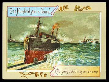
 A third prediction of the dubious kind was “Cruisers evading an enemy.”  It is true that amphibious vehicles of various kinds have become standard in the ordinance of nations.  I have ridden in a “Duck,” (DUKW), a World War II amphibious truck for transporting goods and troops over land and water and crossing beaches in amphibious attacks.  After the war they were used in places like the Wisconsin Dells to haul tourists.  The Duck, however, is far smaller and more mobile than a battleship.  As for avoiding an enemy, the ship would have been more vulnerable to their guns on land than on the sea.
It has been said the invention of the balloon struck the populace of the 19th Century “like a thunderbolt.” (See my post of November 25, 2012.)  This fascination continued through the 1800s, even as the limitations of balloon travel became evident.  None of this seems to have touch the creator of “One Hundred Years Hence.”  Even with the invention of the airplane only months away, the artist has created a scene in which lighter-than-air craft fill the sky.
We have entered the realm of the absurd, as demonstrated again by a trade card that purports to foresee a time when bridges and ferry boats will be dispensable.  People apparently would be able to cross rivers buoyed by their individual balloons.   One chap is riding a unicycle with a water wheel attachment.  The illustration is fantasy, not futurism.
The final image is equally bizarre.  Here we are shown two steam engines towing an entire block of buildings, apparently from place to place.  The caption adds to the puzzle, declaring “City Improvements up to date.”  The card, however, imagines a horse and wagon taking items from place to place, even though motorized vehicles were coming into common use.  So much for the predictive value of  “One Hundred Years Hence.”
This set of trade demonstrates vividly how precarious it is to try to figure out the future from a century away.  In our own time the fascination with “futurism” seems to have ebbed away significantly.  It may be so because the future of the planet appears to hold less promise and more problems, such as those brought about by global warming, air and water pollution, and global pandemics like Ebola and HIV-AIDS. 


Friday, November 21, 2014

Just for Laughs, Come Drink Beer with Me

Anyone who pays attention to beer ads today, particularly on television, knows that comedy plays a large role in selling the suds.  Even in the pre-Prohibition era, decades ahead of TV, brewery advertising employed a considerable amount of humor in trade cards, ads, and other ephemera.  I have collected a few that may bring a smile to the beer aficionado.
The first example was issued by the Christian Moerlein brewery of Cincinnati (see my post of November 22, 2013).  It is a take-off of the familiar nursery rhyme, reading:  “Mary had a little lamb; Its fleece was white as snow.  And everywhere that Mary went, The Moerlein’s Beer did flow.”  The main humor here is Mary’s elderly teacher seen through a windows downing a glass of beer before class.
Schlitz brewery issued several trade cards in the early 20th Century, parodying scenes and lines from Shakespeare.  Shown here is one taken from a climactic scene in Richard III in which the evil king has been bested on the battlefield and is seeking to escape.  Shakespeare has him cry:  “A horse, a horse, my kingdom for a horse.”   On the trade card Richard is willing to swap his kingdom for a glass of Schlitz Milwaukee Beer.
On two trade cards shown here, Miller Brewing of Milwaukee demonstrated a sly sense of humor.  The first, entitled “The Water Wagon in Milwaukee,” shows eight people sitting on top of a keg of beer and being served up steins of brew by a gent standing on a rear bumper.  The vehicle is being drawn by a brace of dachshunds toward the brewery buildings.  Note that the tires are rimmed with sausages, another Beer Town specialty.
Miller also was responsible for a second card dominated by a large man wear a sport jacket and a cap who has his hand comfortably on what appears to be — to use the scientific term —  “a beer gut” of enormous proportions  He is sucking on a bottle and intoning in what must be considered a German accent, “How Ish Dot for High Life Beer.”

Not all humor cards were the work of well-known national breweries.  Before the advent of the “walker,”  the Atlantic City Brewing Company from the New Jersey city of the same name had illustrated an invention that allowed a customer to travel distances with two kegs and three steins.  The rhyme in the corner says:  “In my Walking Chair, I have no fear, of two big a load, of A.C.B Beer.”  This was the principal brand of the brewery, opened in 1900 and said to be the only brewery in Atlantic City in the pre-Prohibition era.  It closed in 1920, never to reopen.

Another invention meant to speed beer consumption was illustrated on a postcard entitled “Beer Lift.”  It shows a pulley-like contraption that is carrying full steins of beer up to the waiting mouth of a seated gentleman and returning the empties from whence they came.  The man seems to be operating it by turning a crank with his left hand.  Although the sign on the wall says “Faust Beer,” a brand issued by the Anheuser-Busch Company of St. Louis, the card is from Herbert’s Bachelor Hotel in San Francisco.  The hotel made headlines in 1913 when Al Herbert, its bachelor owner and operator, got married.   One read:  “Bachelors’ Hotel Invaded:  Cupid Boldly Captures the Host.”

The following illustration, entitled “How McGinty and Family Enjoy Themselves after Drinking Dubuque Malting Company’s Beer.”  The McGintys, none of them evidently wearing bathing suits, are holding a rope while someone intones, “”Now then, all together: One! Two!! Three!!!  What they are doing is virtually inexplicable — but apparently the activity is fueled by beer.  The company responsible for this ad was founded in 1892 by the consolidation of four small Dubuque breweries.  When its new plant was opened for business in May 1896, a crowd of 20,000 early reportedly gathered for tours.  By 1910 Dubuque Malting was the largest brewery in Iowa and among the largest in the Midwest. Statewide Prohibition closed the brewery in 1915.  Legend has it that gangster Al Capone later used the facilities to brew and ship out illegal beer in milk cans.
The humor of young boys drinking liberally from a case of beer over the protests of a mother would certainly draw fire if the image were used today.   Before National Prohibition in 1920 it was generally acceptable to use children to advertise beer.  At least the D. G. Yuengling & Son Brewery of Pottsville, Pennsylvania, thought so.  Established in 1829, Yuengling is accounted as the oldest operating brewing company in the United States, now producing about 2.5 million barrels a year.  The trade card dates from the late 1800s.  
Prohibition also drove some breweries to humor.  Here is a postcard view of three men, wearing a variety of clothing,  all dangling from ropes as if they have been hanged.  The sign on the “hanging tree” says:  “If this town goes dry, us Germans vill hang togeder.”  A brewery in the background has been closed, but these are not the owners committing suicide —two have their hands lied behind their backs.  Some one did this to them.  But who? One would have to ask the Heileman Brewery of LaCrosse, Wisconsin, that question.  That’s where the image originated.
The final example is the label from a self-identified “temperance beverage” whose humor is in its name, “Brother Wiser.”  It is obviously a send up of Budweiser Beer.  Note that like the brew, this drink was made in St. Louis, Missouri.   Needless to say, Augie Busch and his company were not amused.  But the lawsuit that sunk the Brother Wiser was launched in Alabama, not on the grounds of trademark infringement, but to enforce a law that prohibited selling any beverage in the state that had the color, odor or general appearance of beer.  It made no difference that it contained no alcohol.  That decision was rendered by an Alabama Court of Appeals judge named Hugo Black who later would go on to make a distinguished career on the U.S. Supreme Court.
I hope these ten examples have demonstrated adequately that beer and humor make a nice fit together.  So lift one and have a good laugh.   


Friday, November 7, 2014

Celebrating Churchill in Ceramics

          
As one of those many who believe that Sir Winston Churchill was the greatest personage of the 20th Century,  some recognition was required that this month of November is the 140th anniversary of his birth on November 30,1874.  What better way to memorialize him than through the many ceramic items that have been issued with his likeness over the decades.  

The collection of items above are among just a few that the Royal Doulton pottery firm of England issued bearing his face and figure during Churchill’s lifetime and after.  Two items should be noted,  the former British Prime ministers is almost always depicted with a stump of a cigar in his mouth and a bow tie.  The item at left is a  Doulton “Toby jug,” with the handle made up of the traditional English bulldog and the British flag.  The items at right are two full figures that could be stood on a shelf or used to hold and pour cream or syrup.  Note the lip in the hats.
Churchill, of course, achieved his greatest leadership in his face off against Adolph Hitler and Nazi Germany.  The next Doulton Toby shown here, designed by Ray Noble, shows a cigar-less Winston with the handle composed of the faces of his wartime colleagues.  From top to bottom they are, General Eisenhower,  Field Marshal Montgomery, Josef Stalin of Russia, and U.S. President Franklin Roosevelt.  The juxtaposition of Ike and “Monty,” is interesting since in life they did not get along.

A number of pottery items have been designed around famous speeches Churchill made during and after World War II.   The somewhat crudely done statuette shown here is of Winston flanked by the bulldog once again. It was modeled by Douglas V. Tootle for the Kevin Francis pottery in Staffordshire, England.   On each side of the base is a word.  Together they read “blood, toil, tears, sweat.”   Those words became famous in a speech by Churchill to the British House of Commons on May 13, 1940.  Three days earlier he had replaced the Hitler-appeasing Neville Chamberlain and on the 13th he asked the House to declare its confidence in his leadership, while predicting that the future would bring blood, toil, tears and sweat.  The motion passed unanimously.
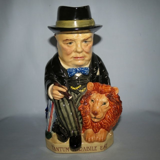
The next ceramic jug shows a full bodied Churchill, cigar and bow tie with his arm around the symbol of England, the lion.  The Latin inscription on the base, “Tantum Mirabile Est.”  Translated it means “So Much is Owed.”  It makes reference to another famous Churchill speech.   He delivered it on August 20,1940, during the “Battle of Britain” when Royal Air Force pilots were fighting a pivotal air battle with the German Luftwaffe as Hitler was planning to invade the British Isles.  In commending the bravery of the British pilots, Churchill said:  “Never in the field of human conflict was so much owed by so many to so few.” On the base is another quote from the man:  “The Nation Had the Lion’s Heart, I Provided the Roar.”
The ceramic bust of Churchill shown left was the product of an anonymous American pottery showing the Prime Minister at his pugnacious best with scowl and cigar.  He was always a popular figure with Americans and he frequently cited the fact that his mother, Lady Randolph Churchill, was an American, born Jeanette Jerome in Brooklyn.  A strikingly beautiful woman, she often has been credited with inventing the Manhattan cocktail at the bar of the Plaza Hotel in New York City.

The next statue showing Churchill giving a speech at a podium and flashing his famous “V for Victory” sign is actually a whiskey decanter issued by the Ezra Brooks Distillery. It memorizes a speech he delivered  at Westminster College in Fulton, Missouri, on March 5, 1946.  With U.S. President Harry S Truman in the audience, Churchill condemned the Soviet Union’s policies in Europe and declared:  “From Stettin in the Baltic to Trieste in the Adriatic, an iron curtain has descended across the continent.”  The speech has been considered an opening volley in the Cold War that lasted some 45 years and the term “Iron Curtain” became common parlance.

Not all Churchillian ceramics are politically inspired.  The British particularly are noted for depicting their royalty and other major figures on rather mundane objects.  The object at right is an example. It shows Winston in his night clothes, including pajamas, night cap and smoking jacket — with cigar.  Take off the tasseled red cap and below a tobacco jar was revealed.  Another pottery piece depicted Churchill in his naval uniform.  He served as Lord of the Admiralty during World War One and frequently was seen wearing navy duds.  This item is an egg cup.

Contemporary use of Churchill’s face and form in pottery tends toward the humorous.  The black and white image of the man on a coffee cup comes from the pseudonymous English graffiti artist known as “Bansky.”  He executes his art with a distinctive stenciling technique that often is transferred by others to commercial items.  Known for his satirical approach to government and society,  Bansky here has given us a sympathetic and perhaps nostalgic picture of Churchill.  The impression left is one of a man both strong yet not devoid of humor.
The final Churchill ceramic is from the hand of Noi Volkov, a Russian now living in the United States.  He is a potter and painter whose recent exhibition was entitled “Reforming the Masters — Unleashing the Humor in Art.”  His specialty is taking famous paintings, adding items and fashioning them all into teapots.   This depiction of Winston is just so.  Note the spout sticking out of one ear.  The handle, citing Churchill’s naval background, is the handle.  The ridiculous top hat is the lid.   While its utility as a teapot may be in question, Volkov has given us a evocative face of the famous man.
These are just a small sample of the ceramic images of Winston Churchill to be found.  My library has a book that contains dozens more.  It is called “Churchill:  Images of Greatness,” by Ronald A. Smith, dating from 1990.  Collectors will find it a great source of information about a wide range of Churchill memorabilia. 


Friday, October 24, 2014

Off to the Opera on the Wings of Commerce

In the late 18th and early 19th Century, as a direct result of the invention of color printing and chromolithography about 1837 in Europe, the use of the medium for advertising purposes became immediately evident.  Arriving in the United States about 1840, it had a similar effect.
The result was a blizzard of “trade cards,” given away by many companies hawking a wide variety of products.  Among them I find cards that depict opera scene to be among the most interesting.  (See my post of April 13, 2013, “Budweiser Goes to the Opera.”)

I am particularly fond of those issued by the Anheuser Busch Company of St. Louis because of the irreverent way in which these trade cards treat even the most tragic operas.  Thee of their cards show here are largely comedic in their intent.  The first is a take-off of one of my favorite Gilbert and Sullivan operettas, “The Mikado.”   In this scene, the scatter-brained and self-absorbed love interest, Yum Yum, is found with her pseudo-Japanese fellow school girls claiming that she is more beautiful than the “flowers that bloom in the Spring, tra-la.”  The beer card, however, has her extolling the blooming hops in Anheuser Beer. 
The following card from the beer-maker is from an operetta called “Boccaccio, or the Prince of Palermo,”  by Franz von Suppe,  a story crafted from the famously ribald Decameron of Giovanni Boccaccio.  The card captures a scene from the first act when Leonello, a student is captivated by the smiles and flirtatious ways of a local lass.  Standing laughing in the background is Boccaccio himself who is in danger from jealous husbands of being chased out of town and arrested.  It appears that all three are drinking Budweiser, described as “the magic that none can withstand, for in its sparkle solace is found…”


Other makers of comestibles also used operatic trade cards, but those I have viewed do not spoof the stories.  Chocolat Felix Potin, who gave us the next card, was a French candy maker who included a wide variety of cards in his packaged confections.  This card shows a scene from the first act of Gounod’s “Faust.”  Here Faust is being temped by Mephistopheles (The Devil) to sell his soul to regain youth and the love of the beautiful and chaste.  Marguerita is shown to Faust in an apparition that causes him to agree.  I can find no other Potin opera card which may indicate that it was not a popular topic.
The remaining cards shown here are from the Liebig Company whose “Fleisch Extract” was a concentrated beef extract to provide a cheap and nutritious meat substitute.  It provided two cards that take the Faust story forward into the third act where the rejuvenated Faust is in the process of seducing Marguerita while the wily Mephistopheles leads away her unsuspecting maid.  The passionate duet between the love besotted couple is one of my operatic favorites.

Another favorite is the opera, “Don Giovanni”(Don Juan), with music by Wolfgang Amadeus Mozart and an Italian libretto.  It tells the story of Don Giovanni described as a “young, extremely licentious nobleman.”  Much of the story is about his wooing and attempting to bed every attractive woman who crosses his path and eluding with scorn all who attempt to bring him to justice.  In the first act, however, Don Giovanni has made a fatal error by killing in a duel the father of one of his attempted seductions. The slain man is the Commendatore, who has a statue of himself in the graveyard.  Don Giovanni invites him to supper and the statue nods approval.  The rake is doomed.  In the next scene the statue comes, offers Don Giovanni a chance to repent, and when he refuses a chorus of demons surround him and take him down to Hell.  By the way, Faust also ended up there.  Opera often was not kind to its title characters.
A word about Liebig.  Liebig’s Extract of Meat Company was named after Baron Justus von Liebig, the German 19th Century organic chemist who developed the product and founded the company.  The meat extract is a molasses-like black spread packages in an opaque white glass bottle.  It contains only reduced meat stock and salt. By 1875, 500 tons of the extract were being produced and it became a staple for Allied soldiers up and through World War II since it did not need refrigeration and could be used in the field.  

Liebig produced many illustrated advertising products: table cards, menu cards, children games, calendars, posters, poster stamps, paper and — most important — trade cards.  These were often in the form of card sets with stories, historical tidbits, geographic tidbits, and other narratives. The sets usually consisted of six cards, one card included per product sale. Many famous artists were contacted to design those series of cards, which were printed using the last in lithographic processes, including chromolithography.  Opera was the subject of several sets.
Among them was a card depicting a pivotal scene in “Mignon,” an opera by Ambroise Thomas that has both French and Italian librettos.   The setting of the illustration is the courtyard of an inn in a small German town.  Gypsies had been dancing for the populace but one, Mignon, refuses and is threatened with a stick by the cruel Gypsy leader, Jarno.  To her rescue comes a young student, Wilhelm, who pulls a gun on Jarno and rescues Mignon.  Meanwhile the girl is comforted by a white-bearded minstrel named Lothario.  As it often turns out in operas, Mignon and Wilhelm fall in love and Lothario in the final scene is discovered to be Mignon’s father.  
The next card depicts the Wagnerian opera, “Parsifal,” a story that revolves around the Holy Grail, believed to be the cup from which Jesus of Nazareth drank at the Last Supper.  It depicts a scene from Act 2, Scene 1, in which the evil magician, Klingsor, standing left, has loosed a bunch of enchanted knights on the virtuous knight of the Grail, Parsifal.  Parsifal has bested them in combat and they have run away.  The lady is Kundry, a sorceress and vamp who has eyes for Parsifal.  The story makes very little sense but Wagner’s music is some of his best and the opera continues to be frequently performed. 
The final trade card shown here depicts a scene from “Falstaff,” a Verdi opera based on the Shakespeare character who appeared in three of the master’s plays,  “Henry IV, Parts 1 and 2” and “Merry Wives of Windsor.”  The plot revolves around the fat rascal, John Falstaff, to seduce two married women in order to get their money.  The picture is of a scene in which a jealous husband has arrived with henchmen to thrash Falstaff who has been hidden by women in a clothes  hamper and almost suffocated.  When the husband hears kissing behind a screen, he thinks it is Falstaff but in reality it is a couple of young lovers.  The madcap antics of this and other scenes, plus Verdi’s music, lifts this to the pinnacle of comic operas. 

The good design and luminous colors of these trade cards are “eye candy” to me and other collectors.   They are made all the more interesting by learning the stories of the operas they    celebrate.  


Saturday, October 11, 2014

Norman Rockwell Had a Head for Whiskey


As a kid in the 1940s, I was addicted to a now defunct weekly magazine called “The Saturday Evening Post,”  rushing home from school to read it on it day it arrived in the mail.  A chief attraction was the frequent covers from the hand of Norman Rockwell, an American artist who lately has achieved iconic status.  Little did I realize at the time that Rockwell also was churning out a series of portraits for a whiskey called “Cream of Kentucky.”

Shown above in his famous “Triple Self-Portrait,” painted in 1960, Rockwell designed 323 covers for the Post and a dozen or more liquor advertisements for Schenley Industries, the manufacturer of “Cream of Kentucky.”   It was one of a number of blended whiskey brands that had sprung up after the repeal of National Prohibition in 1934.   Since this period coincided with the Great Depression in the United States, merchandising of whiskey often emphasized low cost while attempting to give some element of prestige and even snob appeal to the product.  This also was a time when pseudo-scientists were emphasizing facial types and even bumps on the head as keys to behavior.  Ad men were quick to latch on to those ideas. 

Rockwell, who had an uncanny ability to present quintessentially American and appealing faces, was able to oblige.   His images came in several series.  The first three ads shown here have a similar theme.  The portraits are of anonymous, smiling, middle-aged males with a definite affluent look.  The ads each ask a question.   “Have you eyes that spot value?”  The Rockwell portrait makes sure we know that the gent shown has “eyes that spot value” and “lips that relish luxury.”

“Does your face say, ‘I love life’?,” asks another ad.  Rockwell provides us with a laughing head who, we are told, has “sparkling eyes” and “smiling lips.”  He clearly drinks Cream of Kentucky blended whiskey.   But not too much drinking or his eyes may lose that sparkle.  The third example inquires, “Does your face show good judgement?”   In this case the figure is said to have “questioning eyebrows” and “appreciative nose.”  The artist has supplied them both.

From anonymous faces to famous physiognomies is a short step.  The next series by Rockwell was one that featured celebrity heads.   Again there is a question:  “Have you Eyes like Frank Buck’s — seeking Happy Adventure?”   While his name may no longer be a household word, in the 1940s Buck was renowned nationwide as a big game hunter and “animal collector.”  His book, “Bring ‘Em Back Alive,” was a bestseller and he starred in several jungle adventure movies.   Rockwell gives us an excellent likeness of the swashbuckling Buck.   We are directed to his eyes “alert for adventure,” his lips, “fond of life’s good things,” and his chin, “that portrays geniality.”   If our eyes, lips and chin resemble Buck’s, we are told, then we should drink Cream of Kentucky.
Harold Arlen was an American composer of popular music, having written over 500 songs, a number of which have become known worldwide. He composed the tunes for The Wizard of Oz, including the classic 1938 song, “Over the Rainbow.”   His reputation was at its peak when Rockwell featured him in a Cream of Kentucky ad.   The reader was asked: “Have you the eyes of someone who knows how to make A HIT?”  — like Harold Arlen.  Unlike Buck and Arlen, most Americans will not have known who Watson Barrett was.  The ad told them.  He was a “talented scenic designer and theatrical producer.”  Rockwell’s head of Barrett was marked by four arrows.  They pointed out “Features Indicating Talent”:  “Broad forehead with prominent knotty bulges above the eyes.  Long, pointed nose with a decided “bump” at the bone ridge below the bridge. Long-winged nostrils.  Jaw strong and well developed.  Chin pointed — with deep impression below lower lip.”  Rockwell has given us all of these.
At some point the series morphed into portrayals of American sportsmen and Cream of Kentucky was no longer a blend but “straight bourbon.”  Shown here is a Rockwell fisherman and the claim:  “If you are this type you’ll like this bourbon that’s ‘Double-Rich.”  The readers are asked if we have the angler’s features.  Marked are “large narrow Eyes of a type adept at weighing true merit,” and “the ample Mouth of a type with exceptional relish for good food and drink.”  This ad carried socio-babble to new lengths of absurdity.  Rockwell also provided Cream of Kentucky with a images of a golfer and a horse trainer.  As before, the face helped convey the message.
The final Norman Rockwell illustration broke tradition by showing two heads.  One is the distinguished older man, this one in white tie and tails.  He is being served a Cream of Kentucky bourbon and water by a obsequious black waiter.  It satisfies many of the stereotypes about servers of color that I have highlighted in the past. (See my post “Black Waiters:  Fetch, Toby, Fetch” of February 2011.).  Rockwell was not a racist.  In fact, he painted the single most popular image of the Civil Rights Movement.  Called “The Problem We All Live With,” it presents the affecting picture of a six-year old girl, Ruby Bridges, bravely walking with school books in hand between Federal marshals to her newly desegregated school in New Orleans.  Such was the culture twenty five years earlier, however, that the scene above was not deemed offensive.
Norman Rockwell (1894-1978) had a long and productive life as an illustrator and artist.  The posthumous exhibits of his works draw large and enthusiastic crowds and at auction his original paintings go for millions.   Andy Warhol,  Dr. Seuss, and many other American artists of recognized stature have done liquor and beer ads.  That upon occasion Rockwell did  advertising work for a liquor company does not dim his luster.  Or diminish my fond memories of his Saturday Evening Post covers.

Note:  This post has not attempted to recapitulate Rockwell’s long and productive life as an artist.  For those wishing to know more about this remarkable man there is new, well-received book on his life called “American Mirror:  The Life and Work of Norman Rockwell” by Deborah Solomon.