Friday, March 25, 2011

Old Goats and Bock Beer


For hundreds of years a particular brew known as “bock beer” has been symbolized by images of a goat. The concept arose in Germany and many theories have been put forward about why this sweet dark beer, usually produced and consumed in the Spring months, might have seized on this particular animal as a icon.

Some say that the word “bock” comes from the medieval German brewing town, Einbeck (pronounced “Ein-bock”). Others claim it comes from the Hindu language. Whatever the origin of the name for this heavy dark lager beer, it has traditionally been advertised as represented by this ruminant. Pictured here are eight goats, all of a pre-Prohibition vintage, as depicted in trade cards and posters advertising bock beer.

Perhaps the most fascinating is an anti-Chinese trade card for bock beer from 1879. It shows a pigtailed Chinese gentleman being bowled over by a long-horned goat as onlookers raise a glass and laugh. In the background goats are chasing other Chinese. There is no any indication of the brewery that issued the card. The design is from a A.J. Mare of Brooklyn NY. Although anti-Chinese feeling was common in the period, it is a mystery to me why this image was believed to sell beer.

In bock ads, however, goats regularly are knocking people down or doing other destructive acts. A white goat knocks over a black waiter spilling his highball and martini glasses while a comely white girl looks on with her tray of beers intact. Again no brewery is advertised. The lithography company cited is from Baltimore. My reading of this image is that during bock season beer is ascendant over mixed drinks.

The rambunctious goat is evident again in a poster for G. F. Burkhart’s Bock Beer. This time he is chest butting a well-tailored gentleman who is attempting to quaff some brew. The man stands amidst beer barrels and a group of 10 celebrants, at least several of whom seem to be inebriated. Note that at rear among the group is gentleman of color waving his hat.

This image dates from 1877 and was the art work of Charles Wellington Reed (1841-1926), an American artist and lithographer famous in his time for his illustrations. Burkhardt’s Ale and Lager Beer Brewery was located in Boston where it made beer in two massive six-story buildings. Founded in 1850, it survived until the coming of Prohibition.

Artist Reed also did a bock illustration for Burhardt’s Boston competitor, H. & J. Pfaff Brewing Co. Its 1877 poster shows a group of men surrounding a beer keg, out of which a goat is charging. Several hold glasses and are trying to catch the spurting suds. Pfaff began his brewery in 1857. He too was put out of business by Prohibition. Today his facility houses the Roxbury, Mass., Community College.

The violent goat may be contrasted with a more genial animal, one often depicted in the company of a pretty girl. An 1882 bock trade card shows a goat dancing with a girl, both of them brandishing beer glasses, while a second goat plays the fiddle. The dance theme is carried forward in a poster of the same vintage that features a pretty waitress, with overflowing tankards in hand, dancing on a beer barrel with a very attentive goat . No brewery is mentioned. This goat conjures up the image of the satyr, the Roman mythical half man/half goat who frequently is seen in erotic juxtaposition with attractive, loosely clad or nude women.

The satyr implication is even more evident in a 1900 bock beer trade card from the George Winter Brewing Company. Here the goat, whose male characteristics are very evident, is gazing longingly at the maiden carrying a goblet of beer. Or is it the beer that excites him? The Winter brewery, as noted on the card, was located on 55th Street in New York City. City directories of the time indicate that Winter himself resided at 42 Avenue A in Manhattan.

The last bock image shown here is a generic bock poster from a Newport, Kentucky, lithography company that could be hung in a bar window. It dates from around 1912. A young woman and goat sitting are on the wing of a airplane, the suds flying off their beer glasses. Because air travel was a novelty, this scene probably was very trendy in the early 20th Century.

To this day the goat continues to be the symbol of bock beer, to be seen on many a current label. For the most part these contemporary animals are relatively docile creatures. For that reason, I much prefer the “old goats” of pre-Prohibition days.

Friday, March 11, 2011

A Second Look at the Irish


Last year in March my blog was entitled “No Irish Need Apply.” Written as an antidote to the sentimentalism that often attends St. Patrick’s Day, that article featured images of Irish immigrants looking like monkeys, planting explosives, fighting with police, and in general posing a threat to American society.

In this blog I attempt to show the progression that sentiments about the Irish underwent from the late-19th to the early-20th Century. A reminder of the bestial and dangerous Irishman is an 1880s trade card advertising the New Home Sewing Machine Co. It shows a simian-like man pouring a glass of whiskey while tending a range of explosive materials and devices.

The Free Home Co., creator of the card, was founded in 1882 and boasted a New York City address. Acquired by another manufacturer in 1927, products were sold under the Free Home name until 1957. My assumption is that prejudice against Irish was so strong at the time that this image was believed to sell sewing machines.

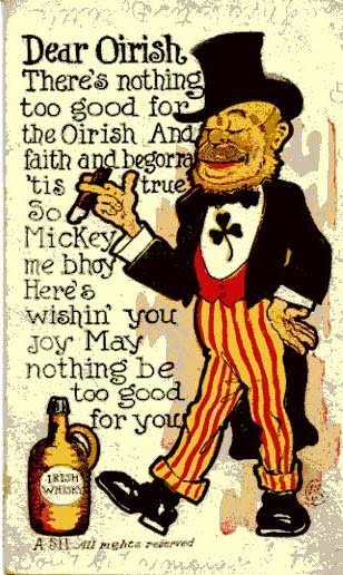
An early St. Patrick’s Day card echoes the notion of the Irishman as a ruffian and a drunk. Note the bottle sticking from his coat pocket. Although the dynamite and bombs are missing from the portrait this is still a dangerous individual. That it is tied to a St. Patrick’s greeting makes it all the more offensive. Just bit more refined, is a “Dear Oirish” postcard of the same era. Both the monkey look and the whiskey jug are evident.

Pond’s Extract was a patent medicine that claimed to cure everything from influenza and hemorrhages to chilblains and hemorrhoids. With an address at 76 Fifth Avenue in New York, the company issued a trade card in 1892 purporting to show an Irishman “bound for Donnybrook Fair” -- an event in Ireland known for being rough and rowdy. Although his looks have improved, this Paddy still wields a club and carries a flask of booze. He is said to be “fully equipped.”

A second postcard from that same year has more complex message. On once side is an American Indian; on the other a elderly man with a pipe. The legend reads: “The Indian with his pipe of peace will soon pass away; But the Irishman with his piece of pipe will last for many a day.” I have seen other cards with the same rhyme. The message seems to be that neither ethnic group was desirable, but the Irish were now the larger problem.

Even so, the image of the Irishman was changing. A 1907 St. Patrick’s card shows a well-dressed, polite son of Ireland, tipping his hat and calling out, “Top of the mornin’ to you.” This was the work of Ellen Hattie Clapsaddle (1865-1934), an American illustrator/commercial artist in the late 19th and early 20th centuries. One of the most talented and prolific postcard and souvenir illustrators of her time, her cards set a tone for an upscale depiction of the Irish.

Within a few years postcards were depicting Irish in an angelic mode. Gone are the club and the whiskey, although the clay pipe remains in the picture. A 1914 card shows an Irishman on angelic wings who is being carried up to the Pearly Gates. The legend tells us “An Irishman dies every time they are short an Angel in heaven.”

The final card, vintage the 1930s, shows the Irishman as arms-around firm friend of Uncle Sam. Their flags fly together amidst the shamrocks. Drink is back but in a decorous fashion. The two raise a glass to the bond between the two countries and peoples -- a far cry from the image produced by the New Home Sewing Machine Co.
The progression from the monkey-faced, drunken and destructive Irishman took several generations to reach the well-clad, genial one of more recent times. The scary immigrant of old morphed to a staunch American fully in the embrace of our national symbol.

What was responsible for the change? I believe the sheer numbers of Irish-Americans and their relatively rapid rise economically in the United States. In America a few bucks in the pocket can result in an ocean of respect.

Friday, February 25, 2011

New Find: Sherwood Bros. Jug from Nebraska


For some 34 years, I have been keep track of American ceramic whiskey jugs and have written two books about them, as well as having collected and viewed hundreds of examples As a result, it is very unusual to be presented with a jug that I have never seen before, particularly one that was produced by a pottery about which I have written extensively.

That is exactly what happened in January 2011 when John Bass of Redding, California, emailed me a picture of a ceramic whiskey, shown here, one completely unknown to me. The the shape and decoration on the jug are exactly the same as a jug from the Wm. Edwards Co. of Cleveland, Ohio. That jug was featured in my blog of November 2009. Both ceramics are marked as the product of Sherwood Bros. of New Brighton, Pennsylvania. Mr. Bass’s jug, however, advertises Country Club Bourbon from E.E. Bruce and Co. of Omaha, Nebraska.

Mr. Bass sent me the picture after seeing my article on Sherwood Bros. pottery. The bottle clearly was well traveled from Omaha. It had been owned by his mother in California. She told him that it had been given to her 40years earlier by her mother-in-law in New Mexico. That lady claimed that the ceramic was then 100 years old. The dating was not quite correct. The ceramic whiskey now is more than100 years old and can claim antique status but it was not quite that vintage when his mother received it. The dating, however, does not compromise the uniqueness of this new find.

Who was E.E. Bruce and his company? Shown here, Edwin Estelle Bruce was a leading druggist and businessman in Omaha. He opened an wholesale drug business in 1887, accounted by contemporaries as “one of the finest in the West.” His company occupied a four story building in Omaha. Like many other drug companies, Bruce’s firm also sold a line of whiskey -- the flagship brand being Country Club Bourbon.

Not only did E.E. Bruce order a whiskey bottle from Sherwood Brothers, he also employed jugs from the famed Redwing potteries of Minnesota. A two-gallon Redwing jug bearing Bruce’s logo is shown here. Made rich by his drug and liquor business, Bruce occupied a Georgian Revival mansion, located in Omaha's Gold Coast neighborhood. He also was well-known in Omaha business circles, according to a contemporary account, respected for his ability, enterprise and ingenuity.

Presumably as a result of this reputation, Bruce was tapped by the elite of the city to be a principal officer for a world’s fair known as the Trans-Mississippi International Exposition. This event was inspired by leading Nebraskans to illustrate the “progress of the West,” highlight the 24 states and territories west of the Mississippi River, and meant to spur economic development. Held a mere five years after Chicago’s highly successful1893 Columbian Exposition, the Exposition ran from June to November 1898.

Bruce held the pivotal position of Exhibits Manager for the Exposition, an extravaganza that covered 108 city blocks in Omaha and involved 4,062 individual exhibits. The success of his efforts can be measured in the 2.6 million people who visited during the six month run of the fair. Constructed quickly of flimsy materials, none of the Exposition buildings survives today. Bruce’s mansion still stands. Moreover, we can remember this Omaha druggist and whiskey dealer by the ceramic jugs, including a new find from Sherwood Bros., that are part of his legacy.

.

Friday, February 11, 2011

Black Waiters: "Fetch, Toby, Fetch"


Last year about this time, as an observance of February’s Black History Month, I featured a blog about the way African Americans have been depicted in whiskey advertising throughout the years. Many of the images proved to be degrading or at best depicted blacks in menial or serving positions. This year my Black History blog will concentrate on blacks in wait service.

Here my conclusion is that whiskey ads often treated black waiters with more dignity before, rather than after, Prohibition. A case in point is an 1894 advertising poster issued by a Cincinnati-based railway that also featured a number of products manufactured in the city. The dignified waiter holds on a tray a bottle of Cabinet Whiskey he is offering to two passengers. This whiskey was a product of the Freiberg and Workum Co. (1855-1918). From distilleries in the company owned in Kentucky they produced and distributed a number of nationally-known brands.

Similarly dignified is the waiter who is serving 15-year-old Old Fitzgerald whiskey to a passenger in an individual small bottle on what the ad claims is one of “the best Railroads in the United States.” This is a 1901 ad from the S.C. Herbst Importing Co., headquartered in Milwaukee with a branch office in Chicago. Founded in 1870, the Herbst organization survived until Prohibition.

Contrast those first two examples with a post-Prohibition1935 ad from Paul Jones whiskey, a brand was from Frankfort Distilleries. Founded after the Civil War by Paul Jones, a whiskey salesman, the company moved to Louisville, Kentucky, in 1886. Frankfort Distilleries survived the years of “Dry” (1920-1934) becoming one of the few outfits that were allowed to produce “medicinal” whiskey under government permit. Providing a quarter of the national supply, the company boasted that 20,000 doctors had written prescriptions for its “spiritus frumenti alcoholic stimulant” -- the word “whiskey” having been banished.

After Repeal, Frankfort Distilleries had a head start on its competition. It funded national ad campaigns that harked back to a pre-Civil War era when plantation owners could sit, smoke cigars and tell the obsequious waiter, “Toby, fetch me the key to the springhouse.” The gentleman at left in the ad was supposed to be the redoubtable, but now long dead, Paul Jones himself. The message here was clear: Let us celebrate the good old days when slavery was in flower.

Other ads emphasized the subordinate nature of the black waiters by giving them ungrammatical speech patterns. Cream of Kentucky “Thee” Whiskey, for example, featured an ad in which a waiter holds a bottle in one hand and a drink in the other. He declaims: “De Kunnel sez Mint Julep.” This brand originated with the Rush Distilling Co. of Jacksonville, Florida.

Similar illiterate speech appears in a 1940s ad from Sherwood Rye. The smiling waiter here tells us “Ain’t had time to sit me down, since Sherwood Rye done come to town.” The same rhyming waiter in another Sherwood ad -- not shown here -- says: “De man who calls for Sherwood Rye, sure knows the bestest brand to buy.” Sherwood Distillery was founded in 1882 in Cockeysville, Maryland. The original operation was closed with Prohibition and the buildings destroyed in 1926. However, the brand name survived and was produced post-Prohibition until the 1950s from a facility in Westminster, Maryland.

Calvert Whiskey took a two page ad in Life Magazine in 1941 to show a black waiter with two whiskey collins on a tray. His speech is grammatical but his manner is a wide grin that communicates how happy he is to be serving. Originally part of the Fleischmann distilling operation in Relay, Maryland, the Calvert facilities and brand name were purchased in 1933 by the Canadian Joseph E. Seagram and Son.

A final example is from Walker’s Deluxe straight bourbon. From 1947 to 1953 this brand featured the same very distinguished black waiter, usually holding a tray on a bottle of the whiskey. Although there was nothing particularly servile in this waiter’s attitude, the ad-makers in one 1953 instance could not avoid the temptation to picture him in front of an old Southern plantation house -- once again harking back to those pre-bellum days. The brand was from Hiram Walker of Detroit and Walkerville, Ontario.

Since the Civil Rights Era of the 1960s, a half century ago, the depiction of black waiters has disappeared from all U.S. whiskey advertising. Other things have changed as well. Now a highly educated, articulate African-American is in the White House. Toby need no longer fetch.

Friday, January 28, 2011

Bottles, Booze and Warhol


If a painting of one Coke bottle is worth $35,360,000, then by inference could a painting of 210 Coke bottles by the same artist be worth $7.4 billion? Shown here is a single Coke by “Pop” artist Andy Warhol that recently sold at auction for that eight figure sum. While not a record for a Warhol (his multiple Elvis sold for over $100 million), the sale still created shock and awe in the art world.

Warhol is enjoying huge attention for his paintings, particularly those done in the last years of his life when he seemingly “sold out” to commercial interests. In Milwaukee last year I caught a glimpse of a Warhol “Last Decade” exhibit that eventually made its way to the Baltimore Art Museum.

Viewing this display, a Washington Post art critic opined: “By the time he died in 1987 at age 58, Warhol had turned selling out into his principal art form. He held a mirror up to our sold-out commodity culture by selling himself as a cultural commodity. This launched a major movement in art.”

Whatever its true importance, Warhol’s production also met the criteria of this blog: It encompassed bottles as well as booze. Among Andy-Pop artworks are ads he produced for Martini and Rossi Vermouth in a four part series that ran in U.S. magazines from 1954 to 1963. They used a “blotted line” technique that became identified with the artist. Shown here in tandem are two of the ads, one of which featured a Warhol self-portrait. My favorite follows: A scene in Venice with gondola and a bright red sun. And, yes, a bottle of vermouth.

Just as notable were a series of ads Warhol created for Absolut Vodka. This was the product of Sweden’s Ahus Skane distillery, with origins in 1879. In 1985 the vodka brand commissioned Warhol to do a color ad that has remained an icon. The artist went on to do several other Absolut ads featuring bottles. With the launch of Absolut’s lemon-flavored Citron in 1988, once again Andy obliged, this time presenting bottles with evident erotic properties.

There is no question but that Andy Warhol has set the bar high for future artists to depict liquor bottles. All future efforts may well seem derivative of this master.

Having started with Andy’s multimillion dollar depiction of a single Coke, we end with another Warhol. This one shows 210 Coke bottles on a wall. I counted them. As suggested earlier, could it possibly be worth billions? Maybe it could be sold to help pay off the national debt.

Saturday, January 15, 2011

Whiskey Risque'


Sex sells -- the ad man’s adage. Several past blogs have dwelt on the use of racy images to grace a saloon (Feb.’10) , merchandise a whiskey brand (Sept.’09), or flog a patent medicine (July’10). When reviewing risqué methods of selling whiskey in the pre-Prohibition era, however, clearly lots more can be said -- and illustrated.

Some of America’s best known brands, including ones that have survived to this day were prone to use the female figure in various states of dress and undress to advertise the virtues of their liquor. A vintage trade card from Old Crow depicted two women, one smoking and both in skimpy outfits. It took little imagination to understand in what profession they were engaged. At this time Old Crow had just come under the control an ownership that combined Kentucky elite distillers and New York money men. The rise of this brand can be traced to aggressive advertising of this kind.

Isaac Berheim and his brother, Bernard, started a wholesale liquor company in Paducah, Kentucky, in 1872. In 1888 he moved to Louisville, bought the Pleasure Ridge Distillery and made a whiskey he called “I.W. Harper,” still a well-known brand. The Bernheim’s built their business by vigorous advertising, including the use of colorful trade cards. Shown here is a double-entendre view of a young stud grabbing at either whiskey or a girl with a low bodice. The caption states: “He won’t be happy ‘til he gets it.”

Risque pull-off and folding trade cards were a staple with the pre-Pro whiskey men and the Bernheims gave the world a prime example with pull-off gown revealing another low bodice, a bottle of whiskey, and a corseted lady of indeterminate occupation. The Puritans were known for being, well, puritanical. Puritan Rye’s fold-out dancer, however, is giving us a good view of her bloomers. I have seen several of these cards and inevitably they develop a hole at a particularly unfortunate place. This brand was the product of David Sachs and Co. of Louisville (1872-1919), whiskey blenders, bottlers and dealers.

Kentucky was not the only source using sexually appealing images to boost whiskey sales. Cincinnati, an Ohio river town even Carry Nation couldn’t shut down, fostered its own set of risque advertising. In those days displaying a female in a state of partial undress was more acceptable if shown in an exotic setting. Hence a picture of a bare-bosomed slave girl serving a statuesque woman in a transparent robe. Clearly this is the Middle East--or is it? The slave has a bottle of Old Windsor Whiskey in her hand, the product of Cincinnati’s Frank G. Tullidge and Co. (1868-1911).

The harem motif also was employed by the Mayer Brothers of Cincinnati (1882-1918) for a trade card merchandising its nationally sold Hudson Rye brand. Closed the card bears the words “Snuff” and “Take a Pinch.” It opens to disclose, not tobacco, but a Middle Eastern odalisque lounging on a divan. Thereby is raised a question: Are we still allowed a pinch?

The Rosenfield Brothers of Chicago (1893-1902), owners of two Louisville distilleries featured three unclothed lasses, with more apparently to come, and found no need for an exotic setting. These ladies appear to be cavorting in a good old American waters without any sign of Victorian modesty. It occurs to me that they had found Rosenfield’s “Sunny Brook” and “Willow Creek” in more ways than one.

The last in this cavalcade of fleshiness comes from the Budweiser Saloon of Springfield Illinois, John Zimmerman Jr., proprietor. The lady appears fully dressed but her fish hook has snagged her dress, revealing --my goodness -- she wears no underclothes. Perhaps even more intriguing is the caption: “Open All Night.” The implications are endless.

Wednesday, December 29, 2010

A Tempest of Whiskey Teapots


Pre-Prohibition whiskey distributors ranged widely in their attempts to merchandise their products through imaginative give-away items to saloonkeepers and the “faces along the bar.” Among the most unusual advertising items were metal teapots inscribed with the whiskey brand name and often the liquor company that produced it.

This blog is devoted to eight such teapots with some speculation on their creation and use.

The first four teapots shown here are from Cincinnati, where the idea may well have originated. In the late 1800s and early 1900s major whiskey distillers, rectifiers and distributors abounded in that Ohio city. For example, in 1881 the 10 leading Cincinnati distillers announced that their production for the prior year was 1.8 million gallons on which $103 million in taxes had been paid. Competition was fierce. As companies vied for market share, they found lots of inventive ways, including metal teapots, to keep their name before the drinking public.

Keystone Rye, the name inscribed on a silver-plated example, was the product of Klein Brothers, a Cincinnati distillery that Samuel Klein founded about 1875. Klein proved to be an excellent merchandiser and the source of such brands as Keystone Rye, Harvard Rye and Spring Lake Bourbon. His whiskey became nationally and even internationally known. He also was famous for his innovative give-away items, among which his teapot must be accounted as particularly unusual.

Sam Klein had formidable competition in a former grocer named Ferdinand Westheimer. In 1879 Westheimer founded a wholesale liquor store in St. Joseph, Missouri, gradually bringing three of his sons into the business. Very successful, particularly with his house brand, Red Top Rye, Westheimer eventually bought the Old Times Distillery in Louisville, Kentucky, and opened a outlet in Cincinnati. Westheimer’s teapot was made in Cincinnati by the Queen City Silver Company, operating from 1888 to the early 1900s.

Joining in this storm of teapots was Charles M. Pfeifer who founded a Cincinnati whiskey distributorship in 1882. His flagship brand was Billy Baxter’s Best, the name he had engraved on a silver plated teapot by the Cincinnati-based Homan Silver Plate Company. This item can be dated with some accuracy because Homan used this specific name only from 1896 to 1904.

Rounding out the Cincinnati quartet was Shields, May & Company, whiskey distributors and rectifiers who featured some dozen different brands of whiskey. Because a San Francisco firm had registered the name “Old Judge” with the Federal government in 1902, it appears that the company was seeking to avoid a lawsuit by labeling this product as Shield’s Old Judge Whiskey. According to its base mark, the teapot was made by the Columbian Silver Company.

Further south in Ohio, another competitor with a regional market for its whiskey also was offering customers a teapot. Founded in 1879 by George Lang and brothers William and Charles Schenck, their whiskey rectifying and distributorship flourished. Occupying a three-story building immediately adjacent to the Columbus, Ohio, courthouse, Lang, Schenck Co. featured Olentangy Rye as its flagship brand.

Herman Abraham, a whiskey dealer whose city of origin I have not been able to identify, used a teapot to advertise two brands he offered. The first, Home Comfort, was from the Joseph Herrscher Company of San Francisco (1907-1916). The opposite side advertised Guckenheimer Rye, from a Pittsburgh distiller that began business in 1857.

A teapot advertising Tom Benton Whiskey hails from a Wisconsin, dealer. His name -- A. (for Albert) F. Watke -- appears on the other side of the metal vessel. Watke appears to have begun business in Milwaukee in 1897 and moved north to Fond du Lac after 1902.

Finally, a silver plated teapot exists marked Sherwood OPS (Old Pot Still) Whiskey. It was the product of Sherwood Distilling of Cockeysville, Maryland, with offices in Baltimore. The distillery was founded in 1883 and within a decade Sherwood Rye became a nationally known brand. This teapot was the product of the Meriden Silver Plate Company (1869-1898) of Meriden, Connecticut.

With one exception, all these firms and brands disappeared early in the 20th Century, most because of the onset of state or National Prohibition. As a result each of these metal teapots can be dated before 1920. The only brand name to survive the 14 year drought was Sherwood, but the whiskey was produced at a different site by new ownership.

What were these metal teapots used for? My guess is this: Because it was not unusual in those days to mix hot water with rye and bourbon whiskey, these items might have been used by bartenders to hold boiled water until called for by a customer to lace his toddy. But this is just a guess. The saloons might even have been serving tea. Naaah.