Friday, September 16, 2011

Whiskey in a Full Metal Jacket


In December 2010, this blog featured eight metal teapots issued by whiskey distillers and distributors to advertise particular brands. Subsequently additional metal containers issued by the whiskey trade have come to light. In addition to teapots they include metal jugs and metal pitchers. Nine are displayed here, along with information about their origins.

We begin with the jugs and a metallic container that advertises Hinkel Pure Rye. It was as the product of the Mathias J. Hinkel Co., located at several addresses in Cleveland, Ohio, including 461 Pearl (1892-1905), 1778 W. 25th NW (1906-1908), and 814-820 Prospect Av. SE (1909-1919). Since the jug does not bear an address, it is impossible to date it exactly.

Hinkel himself was a native son of Cleveland, born in 1867, who left school at the age of twelve to work as an office boy at Edwards, Townsend & Co, eventually rising to the position of manager of the liquor department. In 1892 he struck out on his own, establishing a wholesale liquor business. Eventually it became one of Cleveland’s largest.

The second jug comes from Sandusky, Ohio, bearing the name of August Guenthur. Guenthur was a self-described wholesale dealer in “fine whisky etc.” The metal container advertises Old Jug Rye, which was a proprietary brand produced by J. & A. Freiberg of Cincinnati. Brothers Joseph and Abraham Freiberg traced the origins of their firm back to 1866. Among a blizzard of liquor brands, their “Old Jug” was the flagship. They issued their own metal jug for Old Jug Whiskey, shown here, but in other instances allowed their dealers to add their own names, as August Guenthur did.

The fourth jug hails from the Kentucky Liquor Company. Despite its name, it appears that this vessel was the product of a liquor company in Chicago. Very little appears about it in the public record, but the firm shows up in city directories, located at 295 Wells Street, from 1892 to 2896.

Whiskey Teapots

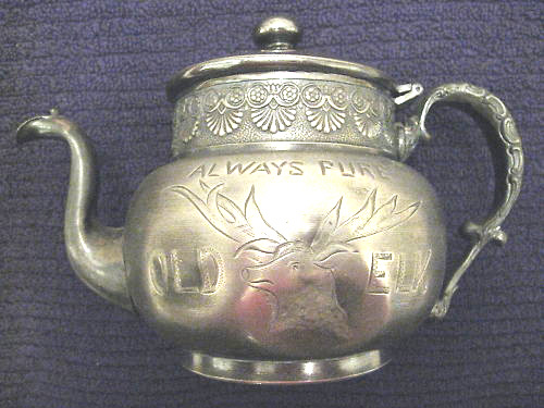
Three additional whiskey teapots are shown here. The first is from “Old Elk.” the flagship brand of Stoll & Co. of Lexington KY. The Stoll family, operating under this name, established the Commonwealth Distillery in 1880. There followed a number of ownership changes in which family members took varying roles, including a time when the company became part of the notorious “Whiskey Trust.” In 1902 James Stoll reformed the company and acquired control of several Kentucky distilleries, making it the largest distilling concern in the state. When James Stoll died in 1908, family once more turned over their interests to the Trust.

M. H. Chamberlain & C0. of Detroit saw a real opportunity in issuing a silver plated teapot. Their flagship brand was “Chamberlain’s Silver Rye” and the metal container was appropriate advertising. This firm was founded in 1879 and existed into the early 1900s. Warehouse records show that the company was obtaining whiskey over the period 1901-1904 from the Burks Spring Distillery in Kentucky. Michigan was the first Midwest state to vote Prohibition in and led to the demise of M.H. Chamberlain & Co.

The third teapot is from a firm that had outlets in Fond du Lac and Milwaukee, Wisconsin. “Tom Benton” was its flagship brand with others being “Crystal Brook” and “Rosehill.” The originating firm may have been Rahte, Haas & Watke (1891), with the partners eventually going their separate ways, at least two of them, including Albert Watke whose name is on this teapot, claiming the Tom Benton brand.

Metal Pitchers

Two metal pitchers issued by whiskey outfits conclude this post. The first advertises the Zeno brand from one of the feuding McBrayer family. One of the clan's distillery was founded in the late 19th Century by Judge W. H. McBrayer. After his death in 1887, the Judge’s estate went to his grandchildren and their father, D. L. Moore, ran the distillery. This jug, however, may have come from another distillery using the McBrayer name, something that fueled intra-family lawsuits.

The final item is a highly decorated silver plated pitcher bearing an embossed crest and the name Gannymede “76” Rye. It is from Cincinnati, an advertising item issued by Sigmund and Solomon Freiberg, brothers from the Ohio whiskey dealing family and related to J. & A. Freiberg. This company first showed up in city directories in 1899 and from the blizzard of brands it featured appears to have been successful for almost two decades. Gannymede “76” brand was its flagship.

These are just a few of the “full metal jackets” through which American distillers and liquor distributors merchandised their whiskey. A subsequent post will describe and depict others that have come to light.

Friday, September 2, 2011

A New Find: Diamond Club Rye


One of the more rewarding aspects of this blog, herein marking its 75th posting, is the response from readers who “stumble on it” while researching collectible items on the Internet and send me emails about them, often with pictures attached. One such reader was Greg Johnson of Minneapolis who sent me the picture of a transfer printed mug, shown here. It was one that I had never seen before. Its provenance was revealed from the bottle from which two men, a farmer and a banker, were drinking. This clearly was the handiwork of George W. Meredith.

George’s story begins in Utica, New York, where he was born in April 1850, the son of Thomas and Elizabeth Meredith. Not long after the family moved to Trenton, New Jersey In 1852, the father died. Mother soon followed him to the grave, leaving George a orphan from boyhood. The youth soon abandoned school to learn a trade as a potter and in 1877 moved to East Liverpool, Ohio.

During the late 19th and early 20th Century this town on the Ohio River was America’s largest producer of ceramic table and vanity wares. Known widely as “Crockery City,” in 1887 East Liverpool boasted 270 kilns and annually produced ceramic products valued at $25 million -- in a time when 25 cents would buy dinner. The largest pottery in town was KT&K -- Knowles, Taylor & Knowles, founded in 1854.

After a year working for a small pottery operation, Meredith in 1878 joined KT&K, working in one of the lowlier jobs -- as a jiggerman. This was the relatively unskilled the laborer who turned the potter’s wheel to shape the clay. But the occupation did not suit him and may even have injured his health. After a little more than two years he left the factory, ostensibly on his doctor’s recommendation.

Almost immediately this 30-year-old determined that a far better occupation was making and selling whiskey. The late 19th century was a time when saloons were opening in every city and town. They did not lack for customers. Lots of folks were going into the whiskey business, many as rectifiers -- operations that refined and blended liquors made by others. Meredith was a rectifier. He rented a storeroom in downtown East Liverpool and with one employee began buying grain neutral spirits in large quantities and blending his own brands, adding color and flavoring.

It soon became clear that despite his lack of book learning, Meredith had a real genius for marketing whiskey. Early on, for example, he called his principal brand “Meredith’s Diamond Club Rye.” Diamond Club was the name of East Liverpool’s most prestigious grouping of businessmen. It took lots of nerve for Meredith to associate his liquor with the club and his use of the name raised considerable ruckus around town. Before long, however, Diamond Club whiskey was a big seller, not only in East Liverpool, but in Ohio, and eventually across America. In time the businessmen’s club itself surrendered and changed its name to “Buckeye Club.”

Key to the popularity of his whiskey were Meredith’s advertising campaigns. His signs were painted on barn sides and rock outcroppings for miles around East Liverpool. He maintained a boat that was moored on the Ohio River and carried a mural advertising his products. One hot August day he even distributed hand fans to Temperance marchers that had an plug for his whiskey printed on the back.

Meredith’s knack for publicity was matched by the themes of his advertising. His newspaper ads and container labels insisted that the whiskey was “pure,” once again exhibiting his merchandising savvy. The hottest consumer issue of the decade was the safety of merchandised food and drink products. The Pure Food and Drug Act would be enacted a several years later and “purity” had the same draw as “all natural” does today. Diamond Club’s purity, Meredith announced, made it “the safest whiskey on earth” for medical purposes. He claimed that one “nip” was worth 10 doses of medicine and boasted that his liquor had been “officially recognized” by the medical profession. How and where, he did not elaborate.

By stressing his whiskey’s therapeutic rather than its lubricating qualities Meredith also was attempting to circumvent the burgeoning Temperance Movement. The business of selling “the safest whiskey on earth for medicinal use” expanded rapidly. Within a decade Meredith was one of North America’s largest whiskey distributors, serving a clientele, as he put it, “from Maine to California and Canada to the Gulf.”

This canny, self-promoting businessman also saw the customer appeal that bottling his whiskey in a whiteware china jug might have. He talked his former employers at KT&K into shaping a distinctive container, one with a graceful tapering body, a serpent handle, a fancy over-glaze label and plenty of gold trimming. On April 4, 1891, the East Liverpool DAILY CRISIS ran an ad stating: “The G.W. Meredith Co. is offering its Diamond Club Pure Rye Whiskey in china jugs that will come in three sizes.” The KT&K whiskey jug was launched -- every one of the bearing the message: “Expressly for Medicinal Purposes.” He also approved a striking design for an “1880” Meredith Rye.

As Meredith grew in wealth and prestige, he branched out in East Liverpool, organizing and becoming principal stockholder in the Crockery City Brewing & Ice Company. He also helped found and later became the president of The Colonial Company, a pottery with six kilns. Greg Johnson’s mug bears the Colonial mark, as does a Meredith stein bearing three monks, also shown here.

The town Meredith had adopted as his own ultimately disappointed him. In 1907 the Temperance marchers had their way when East Liverpool by local option voted itself dry.
He retaliated by eliminating the town name from his bottles and jugs and in 1908 moved his whiskey operations to Pittsburgh. After National Prohibition wiped out his liquor business there in 1920, Meredith migrated to Atlantic City, N.J., where he is said to have made another fortune in real estate. He also bottled a soft drink called “Whistle,” an orange-flavored beverage that had been invented in St. Louis just as Prohibition began. He died in Atlantic City in 1924 at the age of 74.

Meredith’s legacy is in the many advertising artifacts he left behind, ranging from a tiny watch fob in the shape of a jug to a giant ornate lamp stand. Greg Johnson’s recent find of the Diamond Club mug is a strong reminder of the genius of this pre-Prohibition whiskey man.

Thursday, August 18, 2011

Ludwig Bemelmans: Whiskey and Whimsey


My earlier post, Dr. Seuss Sells the Sauce” (July 2010), chronicled the beer and whiskey ads created by the famous children’s author. Although Ludwig Bemelmans may not be as well known, his children’s books have been avidly read for decades. Like Seuss, Bemelmans, shown here, used his distinctive artistic style to draw a series of ads for a whiskey maker. His pictures remain a marvelous, whimsical legacy.

Bemelmans, who was an author as well as an illustrator, was born in the Austrian Tyrol in 1898. Employed at 16 in his uncle’s restaurant, he shot a headwaiter in a dispute and the family gave him the option of reform school or emigrating to America. He chose the latter and as he said...” I bought two pistols and much ammunition. With these I intended to protect myself against and fight the Indians.”

After landing in New York City, he soon joined the U.S. Army during World War I, despite just barely being able to speak English. His antics as a soldier, including firing his pistol at unruly prisoners he was guarding, were captured later in his humorous memoir, “At War with the Army.” After the war Bemelmans writings and art began to gain important recognition. It was not until 1934, however, that he published his first children’s book and followed in 1939 with the adventures of a Parisian school girl named Madeline (named after his wife). As shown here, his delightful drawings were an instant success and the Madeline stories became a series, ending only with his death.

As his fame as a children’s author grew, he continued to contribute drawings and writing to national magazines such as Vogue, Town and Country, The New Yorker, Fortune, Harper’s Bazaar, McCall’s, Holiday and Stage. It was perhaps natural then that the Hiram Walker Company of Detroit and Walkerville, Ontario, one of America’s largest distilleries, would tap Bemelmans’ talents for advertising its flagship brand, Walker Deluxe Bourbon. This whiskey for years had featured a black waiter serving whites -- a theme that probably was losing its market appeal as the Civil Rights era dawned.

As a result, from 1957 to to 1959 Bemelmans drew a series of color ads for Walker Deluxe. By my count there were 11 in all, of which 5 are shown here. The consistent theme is the enjoyment of the whiskey by people who clearly are very, very rich, but each illustration has a waggish twist.

The first ad shown here is of a butler taking a nip from the Walker Deluxe bottle. This caused one contemporary observer to ask: Oh, Ludwig Bemelmans, it’s a mere hop, skip, and a jump from little Madeline causing mayhem in the orphanage to butlers helping themselves to a swig from the drinks cart, isn’t it? Please note the dog in the picture at left: His arch attitude mimics the butler.

The next two ads are similar in theme. In the first, a group of three yachtsmen are served whiskey by a cabin waiter. They are clearly on a yacht while in the background their own yachts are anchored nearby. The second features three Texas oil tycoons, hats and shirts of the type, enjoying a drink while in the background their limos and sports cars, with uniformed drivers, await. Snob appeal with a twist.

The next ad features at least four waiters serving a number of gents (no women appear in any of the 11 Bemelmans ads) in an African safari tree house. The waiter at far left, as in the first picture, is helping himself to a nip of whiskey before serving it. Note that no waiter in any of the ads is a person of color. Hiram Walker executives apparently had seen the error in that depiction.

My favorite is the last image. It shows a waiter serving two portly gentlemen sitting beneath the trophies of prior hunting expeditions. Each animal is worth examining for its slightly different expression, ranging from anger to puzzlement. Bemelmans has injected into this scene, just under the rabbit, top left, the framed picture of an elderly woman, probably the mother of one of the drinkers. They apparently see no irony in her appearance among the trophy heads.

During the 1950s Bemelmans became involved in show business, designing the set for a Broadway production and doing several stints in Hollywood. The murals he painted at New York's Carlyle Hotel bar are still prized for their delightful whimsy. He died in that city in October, 1962 at the age of 64.

Ludwig Bemelmans is buried in Arlington National Cemetery outside Washington, D.C. There his gravestone records none of his many accomplishments as an artist and writer. It states simply, Cpl.U.S.Army, World War I. Of that service to his adopted country, Corporal Bemelmans clearly was justly proud.


Friday, August 5, 2011

Collecting: A Focus on Fantasy


Recently on eBay I saw, bid for and won a heavy brass paperweight on a marble slab, shown here. In bas relief It features a bare-breasted young woman holding a bottle high against the familiar Coca Cola logo. Other features are a ribbon on which appear the words “Refreshing and Delicious” and “Atlanta Ga USA.” In small letters in the upper right appear the words “Tiffany Foundry.”

Tiffany Foundry was a enterprise of Louis Comfort Tiffany (1848-1933) an American artist and designer, shown here, who worked in the decorative arts and is perhaps best known for his work in stained glass. As a foremost adherent of “Art Deco” -- the design of the paperweight -- he also executed numerous metal work items in his foundry, such as the inkwell shown here. Most Tiffany items fetch high prices.

My paperweight is an interesting and attractive piece. It surprised me then to win it with a bid of $15, the price of a modest lunch. Subsequent research revealed, however, that presumably knowledgeable collectors of Coca Cola items, of whom there are many, consider this object a “fantasy.”

The concept was new to me. After some thirty years of looking at, accruing and writing about collectibles, I have become accustomed to looking out for reproductions knowingly or unknowingly sold as the real thing. There are dozens of “repros” that collectors of expensive glass bottles are aware of. Antique watch fobs with value are reproduced (counterfeited?) so frequently that it plagues the hobby.

But “fantasy” items are not reproductions or imitations. They are described by commentators as items that were not designed or in any way issued by the company advertised. In this case Coca Cola. The question remains whether they were meant to fool collectors. Describing them as fantasies seems to me to avoid the question.

The image on my paperweight shows up in other formats, including a belt buckle and a bracelet, shown here. The back of the belt buckle identifies “Tiffany Studio” and “JJ Willard-Phila” as identifying marks. One Coke specialist says: “Unfortunately these buckles are really worthless...Most experts seem to agree that the value of each buckle range from nothing to no more than $10.” ($5 less than I paid for the weight.)

Presumably these fantasies proliferated at one point in history. Shown here is different Coca Cola belt buckle that also is disparaged by the cognoscenti as a fantasy.

The Tiffany folks for a long time were unsure if their foundry had made the items bearing their name because the records had burned during the 1930s and were unavailable. Eventually they decided that the company had not been involved and identified the items as a fraudulent. In the interim, according to reports, some collectors had been gulled to purchase them to the tune of hundreds of dollars.

My paperweight has a felt base and a sticker label, indicating rather recent manufacture, and a reference to the “The Art Mint, Ltd” of St. Louis, Missouri.” Information on this firm is sketchy. It seems not to exist anymore but produced other novelty objects including resin wizard figures, shown here. They surely qualify as fantasy.

For me the personal question remains: Was I defrauded by paying a modest amount for this object, no matter who made it and when, one that has a elegant Art Deco design and format? I don’t think so. It will keep its place in my collection. Given its strong appeal , it would seem ridiculous, regardless of value, to think of this paperweight as something as flighty as a fantasy.

Friday, July 22, 2011

"Comin' Thro' the Rye" - Whiskey, That Is


In 1782, the Scottish poet Robert Burns (1759-1796) wrote a poem that spoke of the sweetness of young love. It is the inquiry of a young swain of his girl friend that if they should happen to meet while walking through a field of grain, and he should kiss her, would her eyes well up in tears? The scene and the verse is shown on a Victorian-era trade card. Ironically, this image was issued by a company selling a laxative called “Sanative Pills.”

Through the years I have collected a number of pre-Prohibition postcards that use the same mantra -- “Comin’ Thro'’ the Rye” -- referring to liquor. Rye whiskey themes show up frequently citing Burn’s lyric and in related guises. The first example is of a well-dressed gentleman with plaid trousers strolling through bottles, flagons and one barrel, all marked “rye.” From the plaid we can assume, I suppose, that he is a Scot.

A very similar image follows. This time the gent is smoking a cigar and from the cut of his jaw the individual is Irish and, under the circumstances, clearly someone who imbibes. The lineup of rye containers he is negotiating includes bottles, flagons and, in this case, two barrels.

In the next card, the barrels have taken the spotlight and the bottles are small. We apparently are looking at a distillery worker who has filled them and is taking them off for sale -- or something. A very similar image was provided by a leather postcard. For a time in the early 1900s leather was a very popular medium for sending images through the mails.

The subsequent card continues the theme. Here the barrels are open and the worker, or a very thirsty person, has by chance or luck fallen into one. In the following card a gent with a top hat has emerged from a barrel of rye whiskey proclaiming that he “arrived here in good spirits.” This card also was tooled on leather.

In the final example, a gent in a vest is resting on a cushion, back to a barrel and sucking from it on a nursing nipple. The container is marked “Fine Old Rye.” Next to him is another cushion and “reserved” nipple. The message is: “I’m saving some for you -- Come on around.”

Rye whiskey cards were fairly common prior to Prohibition. Their frequency was indicative of the strong popularity of that form of spirits for much of the Nation’s history. The fall of rye in popularity with the drinking public since Repeal and the ascendancy of bourbon has been laid to many causes. My own view is that it was not so much the changing taste of the American drinking public as the identification of “rye” with an inferior kind of liquor sold in speakeasies during Prohibition.

Thursday, July 7, 2011

The Tile Club: Hi-Jinks and High Art


In keeping with my strong interest in art tiles, demonstrated in prior posts, I have been fascinated with a decade-long movement of American artists in the 19lth Century to paint on ceramic tiles, a movement that included one of our Nation’s foremost painters, Winslow Homer, pictured here.

The Tile Club was founded in the fall of 1877 in New York by a group of young artists and journalists who had been meeting informally from time to time to discuss art. Homer, an established artist at this point, was a charter member. As it evolved, the Club membership was held to twelve. When members left new ones were admitted by unanimous vote.

The Club was a highly fraternal and cordial type. There were no bylaws, officers, rituals, initiation or other fees. Initially the group met weekly at a member’s studio to, as the name implies, paint on tiles -- something none of them had done before. As detailed in a book by Ronald G. Pisano entitled “The Tile Club and the Aesthetic Movement in America,” the Club jointly agreed to undertake tile decoration and were pleased with the results of the experiment.

Over its life, membership in the Club included such American art luminaries as William Merritt Chase, Robert Swain Gifford, Earl Shinn, John Henry Twachtman, and Julien Alden Weir. Less well known, but charter members, were Arthur Quartly and Charles Reinhart.

In addition to their studio work, the Tile Club took summer outings to the beach, both for camaraderie and to paint. Their hi-jinks and excursions soon caught the fancy of the American press. Scribner’s Monthly of February 1879 featured a story of a Club outing to Long Island that had occurred in June of the previous year. It was captured in a ink drawing entitled “Ye Tilers in Procession.”

Homer (1836-1910) is accounted the most adventurous tile painter of the group. In addition to his use of bright colors on ceramics, he was prolific. Among Homer’s works are six known single tiles, one plaque and two fireplace murals. The first three examples shown here are from the master.

Chase, a young colleague of Homer, would make his reputation as an outstanding American Impressionist. He produced several tiles, including one of an old man in a flat hat, done in 1879, Chase (1849-1916) added his own name into the image before firing it. Today it is in the collection of the Hecksher Museum in Huntington, New York.

Quartly (1839-1886) was an American painter best known for his seascapes. Two of his tiles are shown here, a single tile entitled “Girl on the Beach” and a door panel depicting a fishing boat. Both were done with a limited pallet and indicate Quartly’s fascination with the marine environment.

The final tile is from Reinhart (1844-1896). Born in Pittsburgh, he later operated a studio in Paris. His reputation was largely for his pen and ink drawings many of which illustrated books and other publications of the times. For the Tile Club he created a door panel that included a heroic head and his initials.

With the publication in 1887 of an elegant “A Book of the Tile Club” by its members and the concurrent loss of its meeting place in a New York brownstone, the organization effectively came to an end. In terms of American art history the Club must be seen as a blip on the screen. At the same time the art works members left behind, including a number of tiles, demonstrate that good art can be achieved while having a good time.