Friday, October 22, 2010

Seeing Whiskey Through a Reverse Glass


Reverse painting on glass consists of applying paint to the back of a piece of glass and then viewing the image by turning the glass over and seeing it through the glass. This art form has been around for centuries. It was used for sacral paintings in the Middle Ages and frequently was used for gilded images.

“Verre eglomise,” as the French call it, had something of a renaissance during the 1800s and early 1900s, used by both artists and by the fledging advertising community in Europe and the United States. Quick to see its commercial value in merchandising were American whiskey distillers and dealers. An attractive reverse glass sign in a saloon might entice more customers to imbibe their product.

I find these signs among the most attractive artifacts that the pre-Prohibition whiskey-makers have left to posterity. My favorite is the elegant “art nouveau” sign from John A. Dougherty’s Sons of Philadelphia. The elaborate “W” in “whiskey” is particularly decorative.

This distillery was founded by John Alexander Dougherty, a native of Ireland who arrived as a youth in Philly in 1814 by way of Halifax, Nova Scotia. Originally a baker, Dougherty eventually moved to making whiskey and in 1849 founded the distillery that bore his name. He had several sons who, upon his death in 1866, continued the business until Prohibition.

Pennsylvania was a state that seems to have fostered elegant glass signage. The second example, also from Philadelphia, is redolent with gold. It advertised a distillery founded in 1874 by Angelo Myers. Framed in gold, the sign also features two medallions that commemorate gold medals the whiskey had won at national expositions. This firm, with Myers father and son as presidents, survived 44 years before Prohibition closed its door. Quite unusually, two of four Myers’ one time corporate officers were women.

A third Philadelphia sign advertised the “Army and Navy Whiskey” from the James Moroney Co. A wholesalers and importer, Moroney founded his firm in 1875. Other brands he featured were “Moroney Pure Rye,” “Old Navy,” and “Round the World Scotch.” The company closed in 1918.

In Pittsburgh, the Joseph S. Finch & Co. was founded in 1873 to great success and made its “Golden Wedding Rye” into one of America’s best known brands of whiskey. It was responsible for two elegant reverse glass signs, one that screamed gold and a second that replicated its Golden Wedding logo. In this case, we know the identity of the creator of at least one of the signs. The back of the first, faint but visible, is written: John Golding Glass Sign, 240 Pearl Street, New York.

Although Hill Side Rye is advertised as being Pennsylvania whiskey, the brand actually was distributed by a New York City based outfit (1880-1918) known as Steinhardt Bros. There were four of them - Lewis, Henry, Morris and David. Together they forged a highly successful whiskey business. Not distillers, they collected whiskey from a variety of sources, “rectified” (mixed it) and sold it nationally and from outlets in New York under a number of brand names, including “White Lily Pure Rye,” “Emerald,” and “Lafayette Club.” This sign bears the signature of artist Thomas G. Jones of New York.

Unlike most of the distillers and wholesalers above, Pfieffer Bros. were relatively latecomers to the whiskey business, first opening their doors in 1902. Rectifiers and wholesalers, their glass sign features the firm’s flagship brand, “Silas Moore.” Pfieffer Bros. also sold their whiskey under brands names such as “Dixie Belle,” “Old Cornelius,” and “Tom Hudson.”

Pfieffer Bros. and the other whiskey companies cited above successfully were in business from the time of their founding until National Prohibition. This time spread makes it virtually impossible to date exactly any of these signs. Not so with the company that produced the final example shown here. “Royalty Club” was a brand name of the Anton Friedmann company in Cincinnati, Ohio. City directories first show Friedmann’s organization in 1870. By 1874 it had disappeared.

Although reverse glass advertising signs are still being made, many of them attractive, our legacy from the pre-Prohibition whiskey makers set an artistic standard that will be difficult to match--ever.

Friday, October 8, 2010

Kids Selling Tobacco


Last March my blog concerned the dubious use of children in order to sell whiskey through trade cards and ads. More recently I have become interested in the frequent use of youngsters, up until a few years ago, to sell tobacco products. The interest was kicked off by a 1890 ad for Mail Pouch chewing tobacco, shown here, that featured a laughing baby in diapers and the double entendre caption, “He just found his mail pouch.”

Perhaps West Virginia’ most famous consumer product -- one whose faded ads can still be found on thousands of barns across rural America -- the company began with brothers Aaron and Samuel Bloch, who ran a small grocery and dry goods store in Wheeling on the Ohio River. They also had a small cigar factory on the second floor. They conceived the idea of flavoring the scrap cuttings that were left over from the cigars and selling them in paper bags as chewing tobacco. Thus an industry was born.

The brothers had excellent marketing sense and built the company to national fame. Aaron was succeeded as president in 1902 by brother Samuel, who in turn passed the company along to his son, Jesse Bloch, in 1937. Jesse’s son, Thomas took over in 1947 until the firm was sold in 1969. Mail Pouch chewing tobacco is still being sold.

By using a baby to advertise their chew tobacco the Blochs were only emulating a wide range of tobacco manufacturers who used the images of children to sell their products. In a blog in June 2009, I related how Richard Outcault, the creator of Buster Brown, franchised several cigar makers to use his child cartoon character in their merchandising. One colorful label showed a man blowing cigar smoke from his ears, to the clear delight of Buster and his dog, Tige.

Subsequently I have found four more cigar makers using kids to flog their products. The most interesting are Nabob Cigars. Their box lid features a pair of boys, one white, one black, both in tattered or ill-fitting clothes. The white lad is smoking a cigar and clearly enjoying the experience. The black youngster seems to be wishing too he had a cigar.

Three other lids feature little girls and were sold under childish names. “Toto” seems to have sprouted butterfly wings. “ Lulu” is an preschooler with a shawl and heavy coat. “Elsie” is hatless and leaning on a well. Neither of the latter two looks particularly happy. Were these the children or perhaps grandchildren of the cigar makers? My research has found no answer.

A happier tobacco-selling tike was featured in a trade card by the G. W. Schreiber Co. of Philadelphia, a dealer in tobacco and “segars.” Why a tike catching an eel in a net should be considered an apt selling point for tobacco products escapes me, other than the general idea that images of children catch the attention of consumers.

These images, however, pale before a 1951 series of ads for Marlboro Cigarettes that ran in a number of national magazines. In them a series of super cute infants relate messages for both Mom and Dad. To Mom, the toddler had a question: “Can you afford not to smoke Marlboro?” And a second baby admonishes: “Before you scold me, Mom, maybe you better light up a Marlboro.” Dad got no questions, just approval for always smoking the infant’s choice.

Given what we know today about the dangers of smoking, these ads, particularly the Marlboro campaign of almost a half-century ago, may seem like something out of the Dark Ages. Today it would be unthinkable to merchandise tobacco using kids. But not so long ago....

Friday, September 24, 2010

Snakes in Clay


Right now somewhere in the Carolinas, I believe a potter lovingly is molding a snake onto a ceramic jug or pot. Although he assumes a ready sale for this work of his hands, the artist may be unaware that he is following a tradition almost 500 years old. In fact, this year is the 500th anniversary of the birth of the artisan who early conceived the idea of creating snakes in clay.

His name was Bernard Palissy, French, born in 1510. Shown here, Palissy was a early biologist during a period of great interest in the natural world. Also a potter, he made casts of actual specimens of animals and sea life and reproduced the forms on ceramic platters. Rampant on his dishware are fish, frogs, lizards, crayfish, shellfish, and -- most prominent -- snakes.

Palissy’s pottery developed a cult following in Europe and America during the 1800s. Many potters copied his plates and created ceramics in his “rustic” style. Two Americans were among them. In 1859 Cornwall Kirkpatrick (1814-1890) and his brother Wallace (1828-1896) founded the Anna Pottery in the southern Illinois town of Anna. Although their production included a wide range of ceramic items they have become best known for their snake jugs. Two shown here are among several dozen known specimens.

The traditional view of the Anna Pottery snake jugs has been that they were a temperance artifact and a warning against strong drink. More recent interpretations, with which I am in accord, have a different view. They point out grotesque, sexual and scatological aspects of the jugs, their humor and satirical “over the top” style. Moreover, the Kirkpatricks regularly supplied ceramic jugs and other containers for the whiskey trade. The conclusion is that the Anna snake jugs really are an attack on Victorian values and that the brothers were, like their contemporary Mark Twain, misanthropic humanists.

Whatever their motivation, the Kirkpatricks created snake jugs that fetch tens of thousands of dollars in the rare instances when the ceramics come up for sale. They also inspired generations of future potters to create serpent-featuring jugs, right up to our own time. Shown here are three contemporary examples.

The first is the product of W.A. “Bill” Flowers. Flowers, a North Carolina resident, specializes in ash glazes that impart a “tobacco spit” look to his ceramics. His jug shown here features a single large, smiling snake that seems to be guarding the contents of the jug.
The originator of the second ceramic is Marvin Bailey, a folk potter and artist from South Carolina. He works with salt glazes and often uses color to “dress up” his reptiles. His jug appears to bear the replica of a coral snake.

The third contemporary jug shown here is by a Kansas City artist, who signs his work, “W. Painter.” Known particularly for his mini-jugs, Mr. Painter is a student of earlier potters like the Kirkpatricks and tries to recreate their techniques and motifs. He has given his jug a surface approximating tree bark and looped a thin snake around it that eventually becomes its handle.

The tradition Bernard Palissy began a half millennium ago still is being carried on in small ceramic studios throughout America. For a long time to come we can be assured of viewing snakes in clay. Of Palissy himself, after a lengthy career as a favored potter to royalty, an intemperate outburst led to his being thrown into the Bastille. Although the French king offered Palissy freedom if he would recant, he refused and died in a dungeon cell in 1889 at the age of 80.

Thursday, September 9, 2010

H. L. Mencken and Monticello Rye


Known widely as the “Sage of Baltimore”, H.L. Mencken was the most influential American commentator of the first third of the 20th Century and a man of strong opinions, pro and con, about almost everything. One of his strongly positive views was of Maryland rye whiskey. Of those, the brand name that most often came first to his mind -- it was his father’s favorite -- was Monticello Rye.

This brand was the original product of Malcolm Crichton, who was born in Illinois, the son of a Scottish-born wholesale grocer, about 1840. Moving to Baltimore, Crichton took over a defunct distillery, rebuilt the facility and began producing a whiskey he called “Monticello Rye.”
The 1880s was one of rapid growth as Monticello Rye rapidly became a popular national brand. Under the slogan, “Its All Whiskey,” ads trumpeted the purity and medicinal value of Crichton’s rye whiskey. Distributors like Loeb-Lion-Felix in New Orleans and Peter Welty in West Virginia featured the brand.”

Mencken contended that a friend “always ate rye bread instead of wheat because rye was the bone and sinew of Maryland whiskey -- the most healthful appetizer yet discovered by man.” This was clear to the Mencken family physician, Dr. Z. K. Wylie. According to Mencken, the good doctor “believed and taught that a shot of Maryland whiskey was the best preventive of pneumonia in the R months.” Mencken’s father Augustus, a cigar manufacturer, was entirely convinced. Moreover, when the senior Mencken sent out for whiskey, he wanted Monticello Pure Rye. His famous son recounted:

“His...bill file shows that on December 27, 1893, he paid Courtney, Fairall & Company, then the favorite fancy grocery fancy grocers of Baltimore, $4 dollars for a gallon of Monticello whiskey...Before every meal, including breakfast, he ducked into the cupboard in the dining-room and poured out a substantial hooker of rye, and when he emerged he was always sucking in a great whiff of air to cool off his tonsils. He regarded this appetizer as necessary to his well-being. He said it was the best medicine he had ever found for toning up the stomach.”

When Malcolm Crichton died in 1890, it appears that none of his four sons were interested or equipped to take on the business. By 1892 M. Crichton & Co. had disappeared from Baltimore city directories. But as often was the case with popular brands, the Monticello name lived on. Thomas G. Carroll & Sons of Baltimore (1872-1919) added “Monticello Whiskey” to its own brands. By 1903 the rye brand was being produced by a new Baltimore-based firm called The Monticello Distilling Co.

Baltimore distilling came to a screeching halt with the coming of Prohibition in 1920. Mencken abhorred it. “The chief argument against Prohibition is that it doesn’t prohibit” he commented. “This is also the chief argument in favor of it.” The author personally responded to the “Great Experiment” by selling his car and using the proceeds to purchase a large stock of “the best wines and liquors I could find.” We can guess Monticello rye was among them. Mencken stored them in a basement vault in his home whose door bore a custom-painted sign emblazoned with a skull and crossbones. The sign said: “This vault is protected by a device releasing chorine gas under 200 pound pressure. Enter at your own risk.”

No one celebrated the end of Prohibition with more gusto than Mencken. A photograph on the front page of the Baltimore Sun showed him downing the first beer to be poured at Baltimore’s Rennert’s Hotel bar in 13 years. “Pretty good. Not bad at all,” the paper quoted him saying. But he complained about paying higher prices for liquor after Repeal. Now, he contended, Monticello Rye cost $3 to $3.50 a quart -- not the $4 a gallon his father had paid.

After Repeal, the brand survived, at least into the 1940’s, the vintage of the Monticello mini-bottle shown here. In 1967, after the deaths of Mencken and his brother left their Hollins Street house empty, Baltimore citizens interested in turning it into a museum found in the cellar numerous full bottles of whiskey and wine, as well as a few empties. There is no written record to reveal if Monticello Rye was among them, but we may be excused for believing so.

Friday, August 27, 2010

Hunting for Hugo Thuemler


In the early 1980s as a collector of ceramic whiskey jugs, I bought a canteen-shaped porcelain bottle advertising Puritan Rye, a whiskey from D. Sachs Company of Louisville, Kentucky. On the base was a round pottery mark for the Thuemler Manufacturing Company. It took me more than 20 years to research this firm and its founder, Hugo Thuemler.

During the hunt I discovered something quite unexpected. Thuemler made only a limited number of whiskey jugs -- perhaps as few as four -- but designed and produced scores of different beer steins and mugs for the American brewing industry. He also created them for root beer makers, fraternal groups, tourist attractions, and conventions. Because the company ceased with Thuemler’s death in 1908, every one of these ceramic drinking vessels legitimately can claim the status of antiques.

Hugo Thuemler was born in 1847, almost certainly in Germany. During his youth German manufacturers had developed a process of transfer printing that allowed more mass production of decorated steins. Exactly when Thuemler arrived in the U.S. is unclear, but he brought with him the Old World knowledge of decorating both pottery and glass.

In 1894 when he was 45 years old, he is recorded as living in Rochester, Pennsylvania, a town not far from Pittsburgh. His occupation then was listed as “salesman.” Four years later an area directory carried a notice for the Thuemler Manufacturing Co., a business that described itself as a “manufacturer of novelties, decorators of china and glassware,” This theme was repeated in its billhead. A number of early Thuemler items carry a Rochester mark.

By 1901 Hugo had relocated his operations to the Pittsburgh suburb of Sewickley where he employed a number of skilled decorators. He also maintained a second address, probably a sales office, in Pittsburgh. Subsequently his wares bore a “Pittsburg” (the official spelling for a short time) pottery mark.

Thuemler’s firm filled an evident need for American breweries. In the past decorated advertising mugs and steins had to be ordered from German suppliers with added cost and delay. Hugo’s ceramics, some of them shown here, solved that problem. I am particularly fond of the blue and white stein produced for the Fred Sehring Brewery of Joliet, Illiniois, and the patriotic themes created for Pabst of Milwaukee and the American Brewery of St. Louis. The handle of many steins, like the one from Sprenger Brewing, featured a ceramic portrait of King Gambrinus, the mythical German king who is the unofficial patron of beer and brewing.

Although earlier it appeared that Hugo Thuemler appears to have lived a bachelor’s life, information has come to light in 2015 indicating that he may have had a wife and daughter.  Further, there is some evidence that he kept a residence in Berlin.  In Sewickley, we know he lived at the Elmhurst Inn, a boarding house that originally was a private mansion. According to a newspaper obituary Thuemler died there on September 1, 1908, at the age of 61. Cause of death was listed as “acute indigestion.” After Hugo’s demise, production ceased and all references to the firm disappeared. More than a century later, however, Thuemler items are being avidly collected and prices have risen steadily.

For a decade or more I have kept an ever-growing list of Thuemler products that have come to my attention. It now numbers some 90 marked items and an additional few that are unmarked but may be attributed to Thuemler. The list does not contain prices. Anyone wishing a copy may write me enclosing a self-addressed stamped envelope: Jack Sullivan, 4300 Ivanhoe Place, Alexandria VA, 22304.

Friday, August 13, 2010

A Peek at the "Eye of Providence"


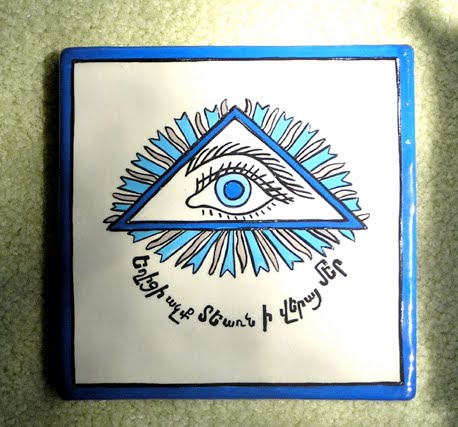
Always finding ceramic tiles of interest, I was impelled to buy one recently on a business trip to Armenia. As show here it is dominated by a single eye in a triangle surrounded by blue and gold rays. The ancient Armenian script at the bottom could not be translated by the shop proprietor but she told me that the import of the tile was keeping away the “evil eye.”

Well, yes and no. Actually this image generally is known as the “Eye of Providence,” representing the ability of the Almighty to see and know what is happening in the world, and -- even more important -- what will happen in the future. The roots of this icon go back to ancient Egypt where the eye of Horus, a god of the Sun and Moon, was frequently displayed and known as a “wedjat.” The single “all seeing” eye was, for example, the central element of seven priceless gold, fiance, carnelian and lapis lazuli bracelets found on the mummy of Pharaoh Shoshenq II and shown here.

With the coming of Christianity, the eye came to be surrounded by a triangle, representing the Trinity and generally was depicted with rays of celestial light radiating from it. An excellent example is found on the Aaachen Cathedral in western Germany, the oldest cathedral in northern Europe. Begun in 786, Charlemagne is buried there. The Constitution of France that includes the famous Rights of Man traditionally has radiated at the top a similar eye symbol.

Most notably the Eye of Providence has found its place in the New World as a standard element of the one dollar bill. On the back of the bill are two circles. Together they comprise the Great Seal of the United States. The eye is on top of a pyramid and above it the Latin for “God has favored our undertaking.” It represents the long and somewhat tedious effort by the Continental Congress, immediately following the Declaration of Independence, to create a seal for the new and embattled nation.

The three chosen for the task were are familiar names: Benjamin Franklin, Thomas Jefferson, and John Adams. Although these were among the most distinguished Americans, none of them knew anything about heraldry. Led by Franklin, they turned to the artist Pierre Eugene du Simitiere, an expert and collector of all things American. Du Simitiere turned out a sketch, shown here, that no one --except the Big Three -- liked. Note that the eye appears in the design.

Not until years later was a seal approved by Congress. Through the leadership of Franklin, the Eye of Providence became a part of the Great Seal. Over ensuing years its presence there has stirred many interpretations and much speculation about its meaning. A recent movie entitled “National Treasure” starring Nicholas Cage has as major premise that the eye is a key to unlocking secrets about a treasure stash. It is also has been linked to the use of an all-seeing eye in Masonic rituals. Evidence is, however, that the Masons adopted the eye as a symbol only after approval of the Great Seal. Note that the Masonic eye shown here does not include the Trinity triangle.

Through the years the Eye of Providence has found its way into other symbols. For example, it is part of the seal of the State of Colorado. Likewise the seal of the University of Mississippi. Very recently the Information Awareness Office of the Defense Advanced Research Projects Agency (DARPA) adopted the symbol as its own. That has engendered speculation that this semi-secret agency has adopted George Orwell’s warning that “Big Brother is watching you.”

Certain powerful images survive down through the centuries even as they take on altered uses and new meanings. The Eye of Providence must be counted among them. It surely has proven its durability as a symbol from ancient Egypt to the present times. If in doubt about that, take out a one dollar bill and look at the back.

Friday, July 30, 2010

A Bit of Lubricity Helps the Medicine Go Down


Out of a constant fascination with the advertising messages of the Victorian era, I have determined that the merchandising most likely to feature sexually titillating themes came from the peddlers of bitters. Bitters were mixtures of herbs, roots and tree bark laced with a generous amounts of alcohol that were sold as cures for a wide range of diseases and ailments. At some point the companies that produced them concluded, as many advertisers have today, that “sex sells.”

In that earlier era, 1880s-1900, one that many identify with puritanical mores, these medicine men often appear to have gotten away with lubricious images on their signs, ads, and trade cards that are startling even by today’s standards. We start with a relatively benign image from Brown’s Iron Bitters. It features a winsome young girl displaying a lovely -- and largely bare -- bosom.

More scandalous are the claims made for this product as a “sure cure” for such maladies as malaria, malarial fevers, and “decay in liver, kidneys and bowels.” A tall order for a tonic that likely carried as much alcohol as a bottle of gin and little else of therapeutic value. It was a product of the Brown Chemical Company of Baltimore, Maryland, which trademarked the potion about 1882 and began suing any other patent medicine with “iron” in its name. Ironically, the principal product of Brown Chemical was fertilizer.

The woman advertising Carmeliter Bitters not only is displaying considerable cleavage but has her skirt hitched up as she leans provocatively what appears to be a bar stool. This nostrum was advertised not only as “The Elixir of Life,” but as a remedy for “all kidney and liver complaints.” It was the product of Burhenne & Dorn who did business at 347 Hamburg Avenue in Brooklyn, New York.

A card memorializing a meeting of the the Grand Army of the Republic (GAR), representing Civil War soldiers was the occasion for Pond’s Bitters to tell a double entendre joke about fighting a battle under a flag, represented by an apron gracing a pretty waitress. As the flip side of the trade card discloses, Pond’s Bitters also included a long list of illnesses it cured, mostly stomach and intestinal ailments, but adding malaria.

The Chicago-based medicine peddler was a particular target of Samuel Hopkins Adams, the journalist whose exposes in Collier’s Magazine in 1905 led to the passage of the Pure Food and Drug Act. In the first of his series on “The Great American Fraud” Adams took aim at Pond’s for “trading on public alarm” by running an ad claiming to cure meningitis with one of its nostrums while New York was suffering an epidemic of the disease.

Rex Bitters was the source of two racy trade cards. One shows a rooster in formal dress trailing a similarly fancy costumed hen with the caption, “It looks like a cinch.”
At bottom left is a baby chick singing a popular song of the day: “Meet me tonight in dreamland.” The second Rex trade card leaves nothing to the imagination, showing a doctor leaning against the exposed breasts of a Gibson Girl. The caption “Heart Trouble” is, however, ambiguous as to which of the two figures it refers.

Rex Bitters, a Chicago-produced patent medicine, advertised itself as curing biliousness, malaria, chills and fever, neuralgia, constipation, pain in back, dyspepsia, sick headache, indigestion, sour stomach, and all “affections” of the kidneys and liver. Despite its obvious alcoholic content, the label advised customers to give children a teaspoonful twice a day and at bedtime “if required.” Rex Bitters merchandising emphasized that it had been recognized as a medicine by the Internal Revenue Department which had slapped a special tax on such products to help pay for the Spanish-American War.

The final example is from Lash’s Kidney & Liver Bitters, an outfit that claimed offices and laboratories in both Chicago and San Francisco. It is perhaps the most salacious of the group. Professing to demonstrate the use of the five senses, it portrays a tryst between an attractive, statuesque woman and and suave mustached visitor. The ending does not need further explanation.

Like the other bitters seen here, Lash’s claimed to be a “sure cure” for a wide range of illnesses including malaria --a seeming favorite among the patent medicine crowd -- and assured customers that it was “positively without equal for all diseases arising from a disordered condition of the kidneys and liver.”

In retrospect, if the bitters companies images seem scandalous, they did considerably less harm than did the bitters themselves. Adams, whose muckraking series of articles for Colliers Magazine helped achieve passage of the Pure Food and Drug Act of 1906, called these so-called “cures” a fraud on the public and even worse, “subtle poisons.” While the Act required a listing of ingredients on the labels of patent medicines, it did not outlaw claims to cure diseases.

The first head of the Food and Drug Administration, Dr. Harvey W. Wylie, in several public statements, however, soon made it known that potions claiming to be cures would be called on to prove those claims. Failure to do so could open them to prosecution for mail fraud. Almost overnight many professed cures were transformed into less aggressive remedies and tonics.

Key words: bitters advertising, Samuel Hopkins Adams