Saturday, July 21, 2018

Still More Kids Selling Beer


I continued to be astonished, amused, attracted — you find a word — for the use of children in beer ads in the pre-Prohibition era, that is, before 1920. This is my third post on the subject.  I find that some brewers regularly used kids to sell their suds.  Two of them are profiled here.  Others seem to have featured them as a “one off,” among a variety of images.

Franz Falk’s Bavaria Brewery of Milwaukee (1856-1892) may have set a record for the use of children in its ads.  In addition of two trade cards I have already shown,  I have collected five more images, like the one shown right.  Initially Falk seems to have been reluctant to show the youngsters in close association with his beer.  This card shows two children ice skating, with the male on the right holding the hand of the girl.  Although skating is a common winter occupation in Milwaukee, the presence of mountains in the background make it clear we are not in Wisconsin

We might be in Bavaria because that is where Falk got his start, learning how to make beer in a local brewery.  He struck out for the U.S. in 1848 settling first in Cincinnati and three months later went to Milwaukee with its strong German population.  By that time all of Milwaukee’s famous breweries — Pabst, Schlitz, Miller, and Blatz -  had been established.  Falk found work at smaller breweries, saving his money until in 1855 with a partner, he built a malting and brewing enterprise in the city’s Menomonee Valley.  

Shown above, a second kiddie card from Falk depicts a young girl contemplating a golf club.  There is no indication what this illustration may have to do with beer.  Later trade cards are more explicit in that connection, for example showing a youthful waiter attempting to bring bottles and glasses full of Franz Falk Brewing Co.’s Milwaukee Export Beer while a dog imperils the exercise by biting onto the lad’s belt.  

Although a similar disaster is implied by a trade card of a small girl who seemingly has been carrying three bottles of beer and two glass goblets on her apron.  She is finding out that the arrangement does not work well as the items begin to spill on the ground.  The little curly hair does not seem to mind, however, as she provides a wan smile.  The only youngster who seems to be having no trouble getting beer from here to there is a well-dressed black girl.  She has put her beers in a sturdy basket.


In a city full of breweries, Falk’s advertising apparently was successful.  By 1872, Franz’s was the fourth largest in Milwaukee.  In 1880 the Bavaria brewery consisted of five brick and stone buildings, including the yards, outbuildings, and side track to the Milwaukee & St. Paul Railway. The site occupied about 5 acres, operating with eight icehouses and on-site malting production of approximately 100,000 bushels annually. Falk employed 100 men, twelve teams of horses and operated its own cooperage. In addition Falk owned their own rail cars for shipping beer.  After a major fire in 1892, however, the Falk family sold out to Pabst.


The Krug Brewery is another that featured children on it's advertising trade cards.  As shown above, Krug went a step further than Falk by showing its kids sitting at a table with bottle and glasses of beer of varying amount of liquid.  They are announced as having a “theatre party,” dressed in costume.  The text makes clear that Krug’s “Cabinet Beer” is “specially brewed for family use” — apparently no matter how young.

In 1859 Fred Krug established the Krug Brewery with an original output of one and a half barrels a day.  Located in Downtown Omaha, by 1880 the company was brewing approximately 25,000 barrels a year. In 1894 the brewery moved to new facilities adjacent to South Omaha.  The plant cost $750,000 and was reportedly one of the best equipped breweries in the country.  Fred was doing well by making children his salespersons and emphasizing family use.

I am particularly struck by one trade cards that show a young lad perched on a stool with a large bottle of Krug’s Cabinet beer on the table in front of him.  He is said to be writing a testimonial to the brew, which would indicate considerable personal interaction with the bottles.  It likely read, as does the card, “Cabinet Beer bring Health and Joy to Every Family.”

My  favorite kiddie ad for beer is the toddler depicted on a trade card by the Indianapolis Brewing Company, the city’s biggest and longest-lived brewery.  Formed in 18897 from a consolidation of three already established brewing companies in the Indiana city.  It survived through National Prohibition and continued operations until 1948.

The last example here is a trade card from the Imperial Brewing Company, the creation of a group of Kansas City investors who saw a growing market for lager beer in a burgeoning population. Financed at $50,000, the facility was to have a brewing capacity of 50,000 barrels.  Plagued by problems of profitability, it went bankrupt in in 1905, had new ownership that changed the name and downgraded Imperial from its flagship brand.  The trade card makes use of the art work of Ellen Clapsaddle, whose depictions of wee ones were highly popular at the turn of the 20th Century.  The card here would have been sent by the brewery at Christmas.

None of these images of children selling beer survived after the fourteen years of National Prohibition.  By then sensibilities about advertising of alcoholic beverages had changed markedly and it was no longer appropriate to identify kids with booze.  Thus these images are now just short of one hundred years old and approaching “antique status.”

Note:  For this blog my first post on the subject of “Kids Selling Beer” was June 18, 2011, followed by a second article on May 21, 2016.  A post devoted to the life and work of Ellen Clapsaddle ran on March 2, 2012.


Saturday, July 7, 2018

Reviewing My Life Through Cartoons


During the last 45 years from time to time people have given me magazine and newspaper cartoons that they believe have some particular relevance to my life.  Sometimes the motivation is that the drawings cite my given or surname;  sometimes because they are relevant to a particular chapter or event in my life.  I have kept those cartoons and, exclusively in this post, now present them in what seems like a reasonable order.

The first cartoon is from Gary Larsen depicting two couples separated by tiny islands, one frolicking on an automobile tire hanging from a palm tree.  The wife of the other couple, apparently critical, remarks:  “Well, the Sullivans are out on their tire again.”  This scene recalls those giddy years 1963-1965 when as newlyweds my wife, Paula, and I lived in Georgetown, D.C., and did at least our share of partying.

But ambition also had to have its day and a New Yorker cartoon seeming caught me at my desk as a young Congressional staffer — appropriately the sideburns, glasses and tie — admonishing my wife:  “Paula, how many times have I told you not to bother me when I’m on the way up.”  (She likely was calling to say one of the children had croup.)

Charles Rodrigues (1926-2004) did not know me when he penned the cartoon above for Playboy, using my surname.  But the situation in my House Foreign Affairs Committee office with my colleague, Jack Brady, was highly pertinent.  The other prisoner wants to spring Sullivan “in the faint hope of getting your incessant babble out of this cell.”  Brady frequently told me:  “With you the second bullshitter never has a chance!”

No question but when Jimmy Carter won the Presidency in 1976 that I wanted out of the Committee “cell” and a place in the Administration.  Another colleague spotted this cartoon by Barney Tobey (1906-1988) in the New Yorker that shows two college professors seeking a “nibble from the Carter transition team.”  I was fortunate enough to get that nibble and ended up as head of the Asia and Pacific Bureau of the U.S. Agency for International Development.


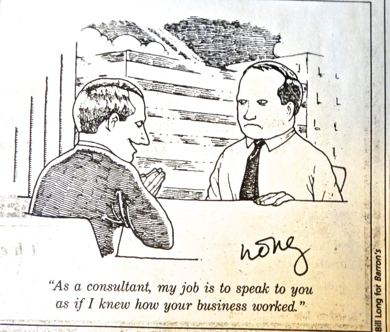
During my four years as head of the Asia Bureau, I trust my service was not as authoritarian as the cartoon right.  The drawing was altered to fit the occasion and sent to me by one of my staff, a noted jokester.  In 1980, Reagan having won the presidency from Jimmy Carter, I was thrust after 20 years back into the private sector, working for an international consulting firm.  One of my friends thought that the Bill Long cartoon was appropriate to my new situation.  


During the period of adjustment, I was engaged in a variety of activities, including organizing kazoo bands, both among extended family members and my co-workers at the consulting firm.  As a result, a Gary Larsen cartoon of cavemen playing a tune on what appear to be lizards appealed to at least one family member as appropriate for me.

In his inaugural address in 1989, George H. W. Bush mentioned “a thousands points of light…all the community organizations that are spread like stars throughout the Nation, doing good.”  The comment gave rise to a multitude of cartoons at the time, including one by Robert Maxwell Weber, known for over 1,400 cartoons that appeared in The New Yorker from 1962 to 2007.  Given my obsession with televised sports, this one had a certain appropriateness.


The final cartoon by Dave Coverly (born 1964) below, also has some relevance.  Although ordered to retire at age 75 by my consulting firm boss after twenty-some years on the job, a man who might be compared with one at the podium, I quit and got another job right away.  But if there had been a retirement ceremony for “Jack,” I might well have written my own “goodbye.”

They say that art imitates life.  It would seem that idea can be expanded to cartoons that, now and again, have imitated my life.  Or was my life imitating those cartoons?


Saturday, June 23, 2018

The Maxwell Touch on Glass Paperweights


On June 15, 1882,  the U.S. Patent Office received an application for a patent from William H. Maxwell of Rochester, Pennsylvania, a town not far from Pittsburgh.  Maxwell, submitting the drawlng shown here, said he had invented “a new and useful improvement in the manufacure of Glass Paper-Weights and other Articles of Glass….”  Granted a patent in September, Maxwell over the next six years produced myriad glass weights using his invention.  As one writer has said:  The Maxwell paperweight is a rare and treasured item for any collector to have in his possession.”

Although I do not own a Maxwell weight, they have always fascinated me by their unique qualities of design and the fact that after Maxwell’s firm disappeared in the late 1880s, no other glassmakers subsequently have tried to replicate the effects he was able to achieve with his distinctive concave base and varying motifs captured in solid glass.  Maxwell’s products may be divided into three categories.  One were one-of-a-kind portrait weights with actual photographs of unidentified people encased in them, as the one shown here.  Unfortunately, because they bear no identification of the subject, they are of limited interest.  

The second category were weights that featured a business. These were mass produced — and probably the major profit center for Maxwell — for businesses who provided them to their customers for advertising purposes.  Among the most interesting of those paperweights is one commissioned by the B. W. Wood & Bros. Coal Merchants of New Orleans.  The main feature is a tug boat, apparently one of two owned by the company and named for members of the Wood family.  A New Orleans Times-Democrat article of March 9, 1882, featured the owner describing him thus:  “Wood is the prince of gentlemen and will pass anywhere as pure gold.”

The next weight advertises the S. P. Shotter & Co, a businessman who began his company in Wilmington, North Carolina and later moved it to Savannah, Georgia.   His company, among other things, made “brewer’s pitch” related to the yeast used in brewing.  The major interest on the weight is the image of two small boys, possibly black, sitting on a barrel.  Shotter probably would not pass as “pure gold” like B. W. Wood.  According to news stories in May 1909, as chairman of the board of a company Shotter was sentenced to three months in jail and fined the equivalent today of $125,000 for violating the Sherman anti-trust law.

Residing in Beaver Falls, Pennsylvania, the Metzger & Company roofers were neighbors to Maxwell’s glass blowing operation.   One can imagine the owner visiting the factory to check out and approve the design, particularly the look of the roof feature.  This weight, like others shown here was a large three inches in diameter and one and three quarters inches high.  The pontil marks on these weights was smooth and fire polished, allowing some to bear Maxwell’s signature or a stamped maker’s mark.

A final weight in the advertising category is from the Amazon Fire Insurance Company of Cincinnati.  It shows a man on horseback with a spear lancing a fiercesome creature on the ground, ala depictions of St. George and the dragon. This horseman, however,  seems to be naked from the waist up.  This firm was headed by a president with the unusual name of Gazam Gano and reported $847,000 in assets for 1871.

The last and perhaps most interesting category of Maxwell weights were those one of a kind paperweights ordered by an individual or perhaps a group to be given to a specific person as a memento.  Prominent among them is a item that depicts a railroad train in considerable detail, down to the number 544 on the coal car.  It appears to have been given to John H. Doyle by a Miss Maggie Tattersall.  Why?  Were they sweethearts?  Was this an engagement gift? The speculation can be endless.

A second individualized Maxwell weight appears to have been made for a woman named Irene Zieg who apparently was competent enough in playing the coronet as to be allowed to play solos.  The picture of the instrument seems well rendered and presented in two colors.   It assuredly must have encouraged Irene on those dismal days when she brought her coronet to a party and no one asked her to play.

Another professional based paperweight was provided to R. T. Betzold who presumably was a pharmacist in Baltimore.  My initial efforts to find this Betzold through city directories of the time have been unsuccessful.   The major element here is the mortar and pestle, often a symbol of the druggist trade.  Again we have two colors, with green plants, perhaps themselves symbols of medicinal remedies, flanking the mortar.

The final Maxwell paperweight was a gift to J. W. Hum, likely related to his activities as a Mason.  I was able to trace him to a news item in which he is numbered among the men who founded a new Pittsburgh Masonic chapter, called the St. James Lodge.  Hum subsequently was elected treasurer of the organization.  This weight I consider the apex of Maxwell’s art.  It is multi-colored, involving shades of yellow, brown and green, with a delicately crafted vegetative design.  There are other weights with a similar motif, including one for “T.B. Wells, Chicago” and one with Maxwell’s own name on it and the date 1882 — marking when he first patented his invention.

Maxwell’s professional career was filled with mishaps.  In 1879 a fire at his glassworks destroyed the entire factory.  His second effort was thwarted in 1883 when a problem with a furnace shut down the plant and caused him to put it up for sale.  Even though he patented a second invention for improving printing on glass, mention of his firm ceases in the late 1800s.  Maxwell's later years are unknown.  For less than a decade, however, this inventive glassmaker provided hundreds of weights, now eagerly sought by collectors.


Saturday, June 9, 2018

The Forgotten Artistry of John H. Bufford


The subtle humor of a trade card entitled “God Bless Our Union” first led me to the artist whose name appears below the image of a mismatched couple. A very large woman is looking possessively at smaller stick of a man who seems much less assured of that the pairing is beneficial.  The illustrator was John Henry Bufford, the first employer and art teacher of Winslow Homer and in his time a successful competitor of Currier & Ives.  Subsequently overshadowed by both, Bufford’s success as a prolific American lithographer and illustrator unfortunately largely has been forgotten. 

Born in Portsmouth, New Hampshire, Bufford apprenticed in Boston and, by 1835, briefly moved to New York, where he opened a lithography business. Five years later he returned to Boston and formed a partnership with his brother-in-law in a new lithographic printing firm, for which he did most of the drawing. The business, with and without his brother-in-law as partner, thrived for the next forty years.


Shown here is a billhead from 1859 in which Bufford describes himself as a “practical lithographer,” meaning that he was turning out not just attractive pictures but practical items such as maps, covers for sheet music, and “show cards,” usually referred to today as trade cards.  Many of those images would fill the upper two-thirds of a cardboard leaving space on the bottom for a message by a tradesman like William Kaess, a Poughkeepsie agent for a beer company who supplied hotels, restaurants and even families with Boehmisch Lager Beer.

Kaess issued a second slyly humorous Bufford card entitled“Warbling at Eve.”  In this one the male partner seems to have the upper-hand as his lady clings close to him.  The look in his eye and her submissiveness indicates that the warbling may soon occur between the sheets.  Observers have pointed out that as he matured Bufford’s drawings became less realistic in favor of a “sketchier” look that for me enhances their appeal. 

An example is a Bufford trade card that shows an exasperated father attempting to lull his crying baby to sleep while the clock registers 1:15 AM.  Entitled “Oh, Rest Thee My Babe,” only the father’s frustrated head and face are fully realized in the drawing.  The baby and the background are only lightly sketched; the contrast contributes to the humor.

Similarly, the next illustration, “Rocked in the Cradle of the Deep,” only the figure of the man is fleshed out.  He is well dressed, with a cravat and a coat.  The wrinkles in his trouser legs are evident as he appears ready to be pitched out of whatever he is sleeping in.  Is it a row boat?  A bureau drawer?  Or perhaps, as advertised, a cradle?  In any case he seems to be sleeping off a bout with the bottle.

As the company matured and lithographic techniques improved, Bufford remained among the leaders.  A 1872 house trade card for his “lithographic establishment” showed a well executed railroad engine to emphasize the speed with which the company executed lithography.  Bufford employed what he called “the best talent in the world” as his artists.  Among those were Winslow Homer put to work in his studio at age 19 drawing covers for sheet music.


Increasingly the Boston lithographer was employing color in his trade cards.  Among them was a chaotic scene in which a thief attempting to abduct piglet is being challenged by the adult hogs in the pen.  The thief is said to be in a “Pig-A-Rious Position.”  My efforts to find something about the advertiser, Henry Max, and his saloon have gone unrewarded. 

A late series of trade cards from Bufford, issued about 1887, involved anthropomorphic renderings of fruits and vegetables.  “An Orange Man” shows a dude with a citrus head and orange trousers posing in front of an orchard.  It was issued by Mabley & Company, a department store located in Detroit, Michigan, that featured 62 departments selling a wide range of goods including clothing and shoes.

Bufford also gave the world a look at what a true cabbage head might look like, dressed with a top hat, three-button coat and beltless britches.  Fittingly the figure is shown standing in front of a cabbage patch.  On another card the head is of a man but his body is largely a potato shown bulging out of the checked pants the ma is wearing.  Labeled “Potato Bug,” the illustration also shows a black man working in the potato fields behind the figure and looking on in astonishment.


The final trade card shown here continues the idea of a vegetable composing part of a human body — in this case, corn.  The high-stepping gentleman playing the horn wears a skirt of corn silk and a leaf as a shawl.   The caption is a bad pun, “Corn-et Dance,”  a far cry from the subtle humor of Bufford’s earlier products.  The master had died in 1870 and my assumption is that other, less subtle, artists were carrying on the work.


Sunday, May 27, 2018

Poetic Justice?

                 
Beginning in elementary school until just recently, I have composed poetry in a number of modes, sometimes comic, sometimes more serious.   In high school I wrote verse for the student newspaper.  In college, I was poetry editor of the university’s literary magazine.  In adulthood, for years I regularly contributed poems to a Northern Virginia nature newsletter and read appropriate verse at my company’s celebrations.

This introduces a contribution I made in 1996 to “The National Library of Poetry,” an Owings Mills, Maryland, publisher that regularly advertised for poems to be selected for its annual volume.  It cost nothing to submit a poem and have it selected by this outfit, but contributors were expected to buy a $50 copy to see their creation in print — or maybe multiple copies to present to relatives and friends.


The entire enterprise seemed to me to be a charade.  The objective of the National Library was not so much a search for good literature but a way of selling expensive books.  It remained to prove my point.  As a result I set out to write as bad a poem as has ever passed through the human mind and send it in.  I called it “Life with Thea” and it goes like this:

Thea, she takes me from heaven into hell,
Her smile, it is heaven.  I know it so well.
Is it only for me?  I wish I could tell.

She tells me always that her heart is true,
She pledges daily:  “Honey, I love only you
Using me?  Abusing me? I wish I knew.

Refusing to disbelieve, but wondering still
Eternally uncertain, weak of will,
Life is passing, thinking of Thea, a chill

Yeasts through my body, my knees go weak
If I utter her name, I can hardly speak,
She is my present but the future is bleak.

Be my lover, Thea, be my friend,
Unique our beginning , uncertain the end,
Lead me again to heaven, let us ascend

Let us go together, Thea, do not hold back.
Surely you will be true to our pact
Help me on the way, find the track

Is this an inspiration I feel?  Yes!
Thea is true, I know — O bless, O Bless!

Now that you have finished “Life with Thea” you must admit that it is one of the worst pieces of verse you have ever read.  (Still and all I am proud of the image of a chill “yeasting” through a body — it is awful but perfectly so.) The folks at the National Library of Poetry, however, were positively ecstatic.  Note below the reaction of “M M” to it:


Not only were they going to print my poem in their annual volume called “Sound of Poetry,” but they found it fully worthy to be printed as well in “what promises to be the most historically important collection of poetry we have ever published.”  To be called “America at the Millennium,” this volume reputedly would drastically winnow down the 1.2 million contributions allegedly received by the Library over the years to a select few of the best poems and poets of the Twentieth Century.  “Life with Thea” had been chosen for that honor!  Wow!  Eat your heart out Robert Frost!


Yet this business is not all fun and games, as explained by Peter Armenti, a librarian at the Library of Congress, in a March 2012 post on his blog “From the Catbird Seat.”  The Library, he says gets about two hundred inquiries a year from people who mistakenly believe that the Library of Congress publishes and sells those anthologies. 

Armenti says the National Library may encourage the confusion by naming the Library of Congress in its copyright page.  Note it below.  The insert seems to identify the Congressional library as cataloguing the volume and assigning an ISBN number to it.  In truth, he says, the Library “only rarely” buys copies for its collection and that this ISBN number was arbitrarily assigned by the publisher.\


In the end, though tempted, I did not allow “Life with Thea” to be published.  As part of my test for the poetry “judges,” I had engineered the first letter of each line, if read down, to spell out a sentence — just to see if anyone was paying attention.  The letters read:  “This surely is bullshit.”  Check it out above. Somehow it seemed to go over the bounds of propriety to permit that to be printed.  If someday someone would recognize the scam it might lead to the firing of some underling.  In the meantime, anyone can feel free to reprint “Life with Thea” — if they dare.  


Saturday, May 12, 2018

“The Man on the Barrel” Through Time

         
As I write this post, the image of a man on a barrel sits before me. It is decoration on a small Doulton pottery cream jug from the Cheshire Cheese tavern off Fleet Street in London, similar to the bas relief Doulton figure shown here.  “The man on the barrel” is a familiar figure to anyone interested in English pottery.    Who is he and what does he represent?  

First of all, the barrel is not just an empty keg convenient for sitting.  It holds something alcoholic, rum perhaps or “sack,” a fortified white wine from Spain much favored by Shakespeare’s Falstaff or, later, bourbon whiskey.  The man on the barrel is a drinking man — sometimes depicted as a drunkard.  For example, here is Brussels faience jug from the late 1700s that depicts a man in a blue coat and yellow pantaloons who clearly has had one too many sips from that wineskin he has next to him.

Other men on barrels of that era could be local heroes.  The one right is a reproduction of an original jug created in 1770 by Ralph Wood of Wood & Sons Pottery in Burslem, England.  The figure is identified as Admiral Lord Howe, the much maligned leader of British naval forces in the American Revolution.  This may have been made before the war with Howe looking benign and holding a foaming pot of beer.  Was it done by friend or foe?  

Skipping forward to the 19th Century is a wood engraving of the man on the barrel by Jean Frederic Wentzel, a French print-maker, born in Wissenbourg, France, in 1807.  He specialized in images of ordinary life as seen in the France of his time and was very popular.  Here he has captured a happy French peasant on a barrel with a spigot conveniently located from which to refill his bottle and glass of wine.

We are back in England with the next example, a flask of a jolly toper dubbed “Old Tom” sitting on a barrel, said to be ware from Rockingham.  Given the inscription on the base, this item is from the Victorian era, about 1850.   Also known as a “reform flask” it celebrates the Reform Act of 1832 in England.

Although he is similarly shaped and dressed, the next two fisted drinker with an all-over brown glaze is attributed to a pottery at Bennington, Vermont, dating from the early 1800s.  Bennington was a convenient location for producing pottery because of the close proximity to local clay deposits, as well as deposits along the Hudson River.  Bennington also had an abundant supply of waterpower from local streams, which was necessary to power the machinery used at the time. Around 1804 stoneware pottery was introduced and achieved notable success, eventually employing hundreds of people.

The late 1800s brought this depiction of a man sitting on a barrel while drinking a glass of wine.  It comes from the Austrian-Hungarian Empire before its demise in World War One.   My guess is the gent portrayed was a political figure who would have been recognizable to the people of the day.  

In 1896, Gustav Schafer and Gunther Vater founded a factory in Thuringa, Germany, with the purpose of making high quality porcelain items. By 1910 the reputation of the pottery for craftsmanship and design had grown to international proportions and Sears Roebuck was importing and selling large quantities of Shafer and Vater ceramics in the United States.

Among the pottery’s products were a host of small figural liquor bottles called “nips.” The term is taken from an Old English word nipperkin, meaning a container of liquor holding a half pint or less. These German giveaways were always imported empty, then filled by a distiller, whiskey distributor, or saloonkeeper and handed off to favored customers.  An example is the “Old Sedgwick” ceramic figural that carries the image of a jolly old Dutchman. It advertised a brand of whiskey from the A. Bauer Distillery of Chicago,

When National Prohibition was adopted in the U.S. in 1920, Schafer & Vater lost a major element of its business and retaliated by creating an image of Uncle Sam as the man on the barrel — a barrel that proclaims “What We Want” and shows Sam filling a glass from a bottle.  This figure also came in brown on a tray with four cups.

The final man-on-the-barrel is a contemporary image of a pirate with an eye patch and wearing a bandana.  He appears to be daring anyone to come close to tapping the keg on which he sits.  Thus we have come full circle from the jolly toper who is sitting on the barrel in order to be as near as possible to the wine or liquor that fuels his joviality.