
Saturday, October 28, 2017

Native Americans Selling Whiskey


The use of American Indian themes in selling a range of medicinals was common in the 19th and early 20th century.  Native peoples were believed to have herbal and other cures beyond Western medicine.  Not so in whiskey advertising and marketing.  Perhaps discretion was suggested by the rampant alcoholism among Indians and their association with liquor often not deemed appropriate.  Nevertheless, over at least a decade of looking, I have found a few examples where Native Americans were used in whiskey merchandizing.


My first examples are two whiskey jugs issued by Martindale & Johnson, a Philadelphia liquor house headed by Thomas Martindale, esteemed as a big game hunter and civic leader.  Both jugs bear the name “Minnehaha - Laughing Waters,” the female heroine of the poem “Hiawatha” by Henry Wadsworth Longfellow.  The ceramic at left shows the Indian maiden sitting by a waterfall as if looking expectantly for her love.  The jug at right apparently shows Hiawatha in a canoe shooting arrows at a fire-breathing sea dragon.  The scene, by the way, has nothing to do with Longfellow’s poem.  


The Indian brave made another appearance on whiskey jugs issued by George Benz & Sons of Minneapolis and St. Paul, Minnesota, a German immigrant who specialized in packaging his whiskey in attractive containers. Hiawatha is shown against a background of wigwams, striding down a path with bow and arrows.  He appears to have an Indian war club tucked in his tunic.  The jug at right recently sold at auction for $332.


“Indian Hill” was a whiskey produced by William Cate of Knoxville, Tennessee.  Not only did it bear a paper label showing Indians, embossed into the glass were the heads of two chiefs.  Cate had a difficult time with prohibition forces, moving several times from state to state to avoid local or state restrictions on making or selling alcohol.  This brand survived through the period of National Prohibition and was re-introduced by another distiller after Repeal.
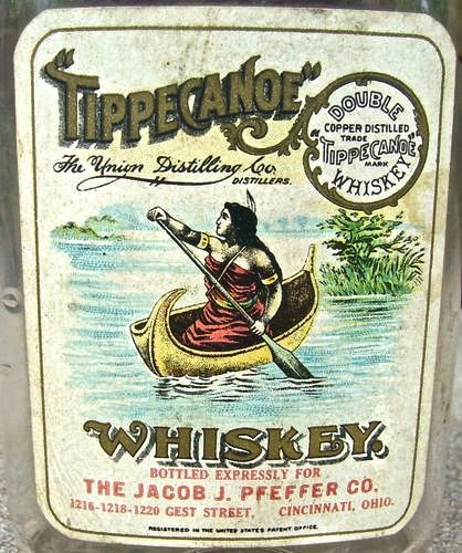

The Indian maiden illustrated in “Tippecanoe,” a double fire copper whiskey from Union Distilling Company, a Cincinnati rectifying (blending) operation.  For saloon signs, almost always displayed in places where women and children were excluded, the husky lass was shown barebreasted.  When used on the label of a bottle that might find itself on a grocer’s shelf or a druggist’s display case where the eyes of the world might see, the maiden was more chastely dressed. 

The man who produced the tray of the Indian brave hunting a buffalo was a larger-than-life character who called himself Andrew Madsen Smith, “The Wandering Dane,” and eventually settled in Minneapolis. Leaving Denmark as a boy his career took him to many adventures as a ship’s cook,  a London street urchin, and then back to sea and, through jumping ship, into the clutches of Indians in the jungles of Brazil.  He also had encountered Native Americans in the West during a period living in Utah.  

“Red Chief Whiskey” was the product of another man whose life reads like a novel and who knew plenty about Indians.  He was Jack Danciger, born in 1877 in Taos, New Mexico, His was only one of two non-Spanish, non-Indian families in the small town.  His father ran a general store in Taos and owned a ranch outside town where he raised cattle.  One story told about Jack is that at six years old he was kidnapped by a nearby Indian chief who was childless and wanted the boy as a son.   When Jack’s whereabouts were discovered,  his parents through careful negotiation were able to retrieve him.


The picture of the Indian princess, Pocahontas, as displayed on the letterhead of R. T. Dawson & Company of Baltimore does not inspire confidence that she appealed to John Alden.  Her nose and chin seem woefully drawn on the Baltimore wholesale whiskey dealer’ letterhead from 1911.  “Pocahontas Whiskey” appears to be Dawson’s only proprietary brand, trademarked by the company in 1907.  My hope is that the bottle label carried a better image.

The final example is the label of a post-Prohibition whiskey called “Indian Trader,” from Frankfort Distilleries Inc.  This was an outfit that originally came under the ownership of Paul Jones with a distillery in Frankfort, Kentucky, and offices in Louisville and Baltimore.  The operation survived the period of National Prohibition by being licensed to sell “medicinal” whiskey, with its brands surviving into the 1940s when it was taken over by Seagrams.

Here they are, a dozen images of American Indians in whiskey advertising and merchandising that have taken years to collect.  Looking them over, it is clear that when Native Americans were depicted, in virtually every case they were presented in heroic or at least dignified ways.  


Saturday, October 14, 2017

More Poking Fun at Beer in Milwaukee


In May 2015 I posted on this blog a series of humorous trade cards and postcards from Milwaukee sources, including breweries, that poked fun at its image as America’s “beer town.” In the intervening months I have collected an additional group of similar images that also deserve viewing.  

The “Happy Days in Milwaukee” postcard provides an appropriate opening to the topic.  Here we are looking at a vested gent who apparently is fishing while sucking on a beer keg floating beside his boat.  He also has a bottle of beer within his reach behind the lawn chair in which he is reclining.   The well-stuffed gent also appears to have caught a fish whose tail sticks up in the bow of the boat.  Relaxation at its best.
The well-dress, top-hatted figure in the postcard above similar looks relaxed — or more likely drunk.  He is a two-fisted drinker, with a stein of beer in either hand.  The reference to Wurzburger flowing in Milwaukee is puzzling since it refers to a beer first brewed by a German bishop in 1643.  Among the earliest German beers to be imported into the U.S., it was made only in Wurzburg, never in Milwaukee.

There follows the images of a stout burgher in a bowler hat drinking straight from the barrel, providing “One View of Milwaukee, according to the captions.  This postcard came in more than one version with the colors of the drinker’s clothing changing while the basic concept did not.

“Touring Milwaukee” is a more subtle reminder of the many large breweries that once graced the city.  The vehicle illustrated has a beer barrel with spigot as the engine and two open steins as the headlights.  For good measure the driver has a third stein ready at hand.  Two containers at the side are labeled with favorite Milwaukee foods — “sauerkraut” and “frankfurter.”
In an oblique reference to the increasing strength of prohibitionary forces, the card above alludes to the fact that brewery owners largely were German in origin. Milwaukee is “Breweryville” and the five characters at the end of rope apparently their owners who, if Wisconsin goes “dry”:  “We Germans must hang together side by each.”   A similar card from Heilman Brewery in LaCrosse, Wisconsin has a slightly different message:  “If this town goes dry, us Germans will hang togeder.”


The Jung beer trade card is known to collectors as a “mechanical.”  When issued it contained a white powder that flowed, if tilted, from the huge stein in the imbiber’s hand down to the pitcher being filled by the rosy cheeked barmaid.  Philipp Jung was born in Germany in 1845 and immigrated to Milwaukee in 1870.  After working in the Jacob Best Brewery and marrying his daughter, Jung broke away to found his own brewery in 1879.  It became a rival to the Best Brewery and its successor beer-maker run by another Best son-in-law, Frederick Pabst.
If you like puns, then a card likely issued by Milwaukee’s Schlitz Brewery may tickle your funny bone.  It takes advantage of a fashion statement begun at the turn of the 20th century when Paul Poiret revolutionized women's dress by introducing a skirt that was that was long and fitted but frequently featured a slit that revealed the wearer’s ankles.   The proximity of “slits” to “Schlitz” seems to have overcome the good sense of the card designer, leading to the image shown here.

Sometimes the humor involved in Milwaukee beer-related ephemera seems unintended.  Such is the “Pabst Everywhere”  card that shows four construction workers, apparently on their lunch break, one of whom is drinking from a large vessel.  The tag line is “Pabst-Milwaukee is enjoyed by the workingman.”  Yet one is left wondering how steady on the job these midday drinkers will be after drinking their lunch. 

The final example is an advertisement for a 1904 Pabst Calendar showing 12 children from a wide range of countries, each attached to a month.  This calendar could be obtained from the Milwaukee brewery for ten cents in coin or stamps.
It is called a “stork calendar” and shows a large bird front and center, one that apparently has brought the tots.  It occurs to me that a subliminal message is:  “Drink beer and make babies.”  But it just may be me.

The identification of Milwaukee with beer long since has faded into obscurity.
The Jung Brewery closed with National Prohibition.  Schlitz sold out in 1982.  Pabst is a holding company with a blizzard of brands, no longer headquartered in in Milwaukee but in Los Angeles.  Only Miller remains of the major breweries that once identified the city as “beer town.”  Yet remaining to us are these reminders of a day when Milwaukee gloried in the suds —and laughed about it as well.


Sunday, October 1, 2017

Newspaper Paperweights — Securing the News


Certain industries seem to have made the paperweight a preferred method of marketing.  Newspapers were among them, with two modes.  One was a heavy metal bar that was given to newsstands to keep their papers from blowing away.  The second, to be considered here, were smaller, lighter paperweights that carried an advertising message and meant for the general public.

Boston newspapers seem to have vied for attention most competitively.  The Boston American chose for its weight to feature Mutt and Jeff, two popular cartoon characters created by Bud Fisher and running daily in the American.  Begun in 1907, the strip ran nearly fifty years and was one of my favorites as a kid.  The American was even older, having been founded as a tabloid in 1904.  It became part of William Randolph Hearst’s chain of newspapers, eventually merged with other local sheets but the name disappeared in 1961.

The Boston Herald, founded in 1846 and still in circulation, is one of the oldest daily newspapers in America. Over its history it has received many awards including at least eight Pulitzer Prizes.   The Herald chose to advertise through a paperweight and pocket mirror with a newsboy hawking the “New England’s greatest newspaper.”  Initially a full-sized sheet, the paper converted to tabloid format in 1981.

Choosing to advertising its status as having the largest circulation in New England via the spacious belly of a cartoon character, the Boston Globe could boast at least 26 Pulitzers.  Founded in 1872 it is locally owned and in 2016 had a circulation of 245,814, making it the 25th most read newspaper in America.  Its investigative team was the basis of the 2015 motion picture, “Spotlight.”

Perhaps the most classy weight ever issued by a newspaper came from The New York Post, a newspaper that claims its origins in 1801 and Alexander Hamilton.  It issued a crystal apple made by Tiffany & Company.  It is etched in acid “New York Post, The Juice of the Apple.”  The modern version of the paper is published in tabloid format and has been owned by media mogul Rupert Murdoch since 1976.  Just as Murdoch bears no resemblance to Hamilton, the Post has no resemblance to the respected paper of the past.

Another attractive contemporary glass etched paperweight is from the Baltimore Sun, another newspaper that has declined from past glory.  The paper once was known for its overseas presence.  At its height, the Sun ran eight foreign bureaus, giving rise to a 1983 ad that “The Sun never sets on the world.”  Unfortunately those sunny days have since departed since the paper was bought by the Chicago Tribune.  One by one those overseas bureaus closed and in recent years the Sun has declined in quality and readership.

The Cleveland News could trace its antecedents back to 1868, officially being founded in September 1905.  Who Geo. E. Harper was, my research has failed to reveal.  I assume he was a major figure on the staunchly Republican newspaper and decided to issue a paperweight.  Always the third newspaper in Cleveland behind the Plain-Dealer and the Press, it suffered financially during the Great Depression and closed in 1960 when it was absorbed by the Cleveland Press.
Even smaller newspapers often issued weights.  The New Haven Evening Register selected one of its front pages for its glass artifact.  Founded in 1912, the Register is a daily owned by the Hearst interests that covers 19 cities and towns within New Haven and Middlesex Counties.  Like other dailies, especially those published in the afternoon, this paper has suffered declines in circulation in recent years.

The paperweight shown here emphasizes the years in which its several newspapers were founded:  The Intelligencer Journal in 1794, Lancaster New Era in 1877, and Sunday News in 1923.  Unfortunately, none of them are currently extant.  Instead the LNP Media Group owns and publishes LNP, a daily newspaper in Lancaster County, Pennsylvania, and several other local publications.  It is controlled by a family, however, whose roots in local journalism go back to 1866.

The Herald-Palladium has had its current name only since 1975, it can trace its origins back to 1868 when the Palladium was established as a local weekly.  It serves the twin cities of Benton Harbor and St. Joseph, Michigan, towns that sit on opposite sides of the St. Joseph River as it flows toward Lake Michigan. After a dizzying series of mergers, acquisitions and name changes over the years, the current paper emerged in 1975.  Its paperweight shows a light house on Lake Michigan.

Even U.S. weekly newspapers might issue paperweights.  Shown here is an attractive item from the Cayuga Herald of Cayuga, a town of barely over 1,000 residents in Vermillion County, Indiana.  This newspaper had a relatively short run, being founded in 1891 by one Charles E. Cook and out of business a decade later.  This allows a much more precise dating of the weight, one that has a element of crudeness in its fashioning that renders it interesting as a glasshouse product.

The final paperweight carries an element of mystery about it.  Was issued by a “Ledger” newspaper but there are at least six U.S. journals, past and present, that carry that name.  It has an ad for Hires Root Beer, which dates from 1876 until today — no help at all.  I  have included the weight here because the delightful little girl is wearing a hat made from a newspaper.  Head coverings similar to this one have been popular with printers since the 1700s.  They would make a paper hat at the start of each day to keep grease, paint, paper lint, and oil out of their hair.

In featuring newspaper paperweights I have just included a dozen of the more interesting examples.  Dozens more exist for the collector, providing a window into the history and development of the American newspaper.


Sunday, September 17, 2017

Examining Risqué Bitters Advertising

Having examined in four previous posts the risqué images that often accompanied whiskey advertising, attention here moves to the sometimes racy, sometimes double entendre, world of bitters beverage merchandising.   

While some bitters may not have had the same alcohol content as liquor, they almost always eclipsed the amounts found in wine and beer.  For most of the 1800s, they were advertised with extravagant claims about their ability to cure all manner of diseases including malaria, kidney stones, rheumatism and even impotency.  With the coming of the Pure Food and Drug Act in 1906 most purveyors toned down their advertising to dealing with problems of digestion and defecation.   

In order to spark interest, however, bitters manufacturers often resorted to advertising in trade cards and postcards with images meant to titillate the viewers.  Among the leading purveyors was Lash’s Bitters, a company founded in Cincinnati and later moved to San Francisco.  It specialized in “hold to the light” cards in which a fully dressed woman when lighted from behind is shown in underclothing.  One is shown here.

It also could go farther in its saucy images.  Shown above is a tableau in which the five senses are cited.  It shows a young woman who is seeing a figure in the distance, is hearing his approach at the door, smelling the bouquet he has brought, each feeling the warmth of their embrace, and finally tasting — what?It takes little imagination to understand what is going on.

Only rarely did the bitters makers resort to nudity but Lash’s provided the public with an example that was clothed in a medical context.  A doctor is examining a very attractive female patient who, according to the caption, has “heart trouble.”  She has pulled up her night gown so that the attending physician can listen.  Although the stethoscope was invented in 1816 and was standard equipment for U.S. physicians in 1900, this doctor has decided that an ear pressed to a breast gives a better diagnosis — or something.

George M. Pond was the manager of Lash’s branch in Chicago.  Having mastered the art of selling bitters, he struck out on his own, establishing a company he called the Ponds Bitters Company located at 149-153 Fulton Street, Chicago.  For some 15 years, employing many of the merchandising ploys he learned at Lash’s, he thrived.  Those included risqué advertising, with several examples shown here.  The first, “Stopped for a Puncture, with an outrageous double meaning, is my favorite.

The ad “Maud with her little bear behind,” shown front and back, was a somewhat bizarre take on an old knee-slapper anecdote.   Shown below left is a Ponds card titled “Taking in the Sights”  and the card right bears a caption indicating that the man on the phone is giving an excuse to his wife about being late for dinner.

In June 1916, the city prosecutor of Chicago filed suit against Pond’s Bitters Company,   A test of the product by the health commissioner had found that Pond’s Bitters were more than 20 percent alcohol and required the company to obtain a license for selling spiritous liquor.  The suit sought $200 in damages from Pond’s which likely was instantly coughed up since the amount  was a small price to pay for immense profits being reaped from the bitters.

Many distillers and whiskey wholesalers featured a line of bitters — for good reason.  As “medicine” they did not fall under the liquor revenue laws and escaped significant taxation.  Second, bitters could be sold in dry states, counties and communities where whiskey was banned.  Among those taking advantage of these opportunities was Alexander Bauer, a Chicago liquor wholesaler, with a reputation for chicanery, as well as the ribald.  Look closely at this Pepsin Kola and Celery Bitters ad and the story becomes clear.

Carmeliter Bitters and its “come hither” lady bearing an “elixir of life,” poses something of a mystery regarding its origins.  The several variants of the bottle are embossed with different names, including Frank R. Leonori & Co. and Burhenne & Dorn.  Leonori was a New York City organization located at 82 Wall Street.  Burhenne & Dorn was a liquor house in Brooklyn at 349 Hamburg Avenue.  This nostrum was alleged to be for “all kidney & liver complaints.”

Union Bitters advertised that it would be found “grateful and comforting” where manhood needed to be restored or where “men have lost their self-respect.”  The Union Bitters recipe is recorded containing gentian, peruvian bark, roman chamomile, quassia bark, bitter orange peel and most important, 50% alcohol.  As if those ingredients were not enough to strike an erotic spark, Union Bitters provided a “mechanical” trade card which initially purports to show a peeping gent seeing a woman’s bare behind.  Opening the card, it is revealed as a a pig’s hind end.
The final trade card is from Dr. Roback’s Stomach Bitters.  Those in the know relate that Dr. Roback was neither a doctor nor named Roback. He was an unsuccessful farmer turned salesman who in 1844 escaped debtor’s prison in his native Sweden and headed for America.  As Dr. Roback in Boston he sold horoscopes and founded an astrological college.  Then he moved into patent medicines and a bitters nostrum, selling his stomach bitters first from Philadelphia and later from Cincinnati where he died in 1867.

Although the dozen items shown here are just a few example of the risqué advertising from bitters manufacturers, they demonstrate the range of images chosen to intrigue and sell a customer.  

Note:  For anyone interested in seeing the images from my four posts on risque' images in whiskey advertising, they appeared in January 2011, July 2012, July 2013, and January 2017.


Saturday, September 2, 2017

Fortune Cookies Have Told My Life’s Story

   
No, not really, but I have collected several dozen fortune slips over the years that have had particular interest.  My modus operandi is to take a Chinese fortune of note and scotch tape it to a beer mug.  Every so often, as the mug surface fills up, I take them off and paste them on paper.  Because Wednesday, September 13, 2017, is National Fortune Cookie Day, I am prepared to reveal much of what they have told me, beginning about 1975 and up to the present day.  

Early Fortunes:   One fortune that clearly caught my attention went this way:  “It is very possible that you will achieve greatness in your lifetime.”   Well, that really did not happen.  I have not sought anonymity but it has pursued me relentlessly throughout my life.  More promising was another cookie fortune:  “Your family is young, gifted and attractive.”  I’d like to think that was true — both sons proved to be gifted and achieved advanced degrees — but none of us is young anymore.

My career involved a great deal of travel and I was able to work all over the world, but occasionally got becalmed with home office work and chafed to go abroad.  Perhaps that was the situation when the following came to me:  “Traveling more often is important for your health and happiness.”   Another cookie provided a formula for successful travel:  “You have the ability to adapt to diverse situations.”

2002-2009 Fortunes:  This one seemed at least partially appropriate, if not exactly predictive:  “You are a lover of words.  Someday you will write a book..”  By the time this showed up I had written the only serious book I would ever write — about the war powers of the President and Congress.  During this period, however, I cobbled together three books on whiskey containers that were self-published and in limited editions, sold out.

“Cleaning up the past will always clear up the future!”  Now that is something to think about.  At the urging of friends I did a brief autobiography called “Memoirs of a Spear Carrier.”  To my knowledge none of the revelations there about my past life really cleaned things up.  Nor, it now seems, did the future become any more clear.  For that one needs more fortune cookies.

During this period I received a cookie that had its own irony attached.  It read:  “You have a deep appreciation of the arts and music.”  It was a reminder that for a time on a newspaper I was assigned to review performances of classical music, of which I actually knew nothing.  My standard line for concerts of stringed instruments was to compliment “deft fingering.”  After comparing the cello to “a beautiful woman,” and throwing in a note on deft fingering, the paper relieved me of those responsibilities — to my great relief.
2009 to Present:  In the most recent period, I find some fortunes prophetic.  For example:  “You may attend a party where strange customs prevail.”  I can think of one in Micronesia a few years ago.  We sat outside in a circle and a drank a liquid pounded from the root of a muddy pepper plant, strained through a palm frond.  After I took one sip of the green slimy stuff, pity was taken on the haole (white person) and I was give coffee as a chaser.

Another is:  “You would make a good lawyer.”  That is the profession my mother had in mind for me and over the years I have been involved in making laws (Congressional staff) and criticizing them (local government).  The city attorney in my city assumed I was a lawyer.  My reaction is to be thankful I chose journalism instead of the law.  Lots more fun and fewer responsibilities.

As I move into the twilight of life, some fortunes clearly are out of touch with reality.  For instance:  “You shall seek out new adventures.”  And: “You have an important new business development shaping up.” Still others seem problematic:
“You will maintain health and enjoy life” and “Your winsome smile will be your sure protection.”    More cogent is the following cookie-born advice:  “Relish the transitions in your life — they will happen regardless.”  

Ten days from now when Fortune Cookie Day rolls around, you can be sure I will be ordering in Chinese food and asking for my fortune cookie.  Who knows, it may give me something to think about — and perhaps paste up for future reference.