Saturday, November 19, 2011
Alphonse Mucha and His Art Nouveau Drink Posters
In past posts, readers of this blog have seen my interest in “Art Nouveau,” the artistic movement that took hold in the latter part of the 19th Century in Europe and America that featured organic influenced shapes and sinuous lines. As a result I have long been interested in Alphonse Mucha, a Czech who was one of the leading practitioners of this form. Among his creations were a number of illustrations to merchandise a variety of alcoholic beverages, including champagne, cognac, liqueurs and beer. Through this post I have brought the images of these Mucha creations to one place on the Web. Note too that many Mucha illustration depict bottles.
His Wikipedia biography gives details of the life of Mucha, who died in 1939: "Alphonse Maria Mucha was born in 1860 in the town of Ivanice, Moravia (the present Czech Republic). Although his singing abilities allowed him to continue his education through high school in the Moravian capital of Brno, drawing had been his main hobby since childhood. He worked at decorative painting jobs in Moravia, mostly painting theatrical scenery.
"In 1879 he relocated to Vienna to work for a major Viennese theatrical design company, while informally augmenting his artistic education. When a fire destroyed his employer’s business during 1881 he returned to Moravia to do freelance decorative and portrait painting. Count Karl Khuen of Mikulov hired Mucha to decorate Hruaovany Emmahof Castle with murals and was impressed enough that he agreed to sponsor Mucha’s formal training at the Munich Academy of Fine Arts. “Mucha moved to Paris in 1887 and continued his studies at Academie Julian and Academie Colarossi. In addition to his studies, he worked at producing magazine and advertising illustrations.
"About Christmas 1894 Mucha happened to go into a print shop where there was a sudden and unexpected need for a new advertising poster for a play featuring Sarah Bernhardt, the most famous actress in Paris. Much volunteered to produced a lithographed poster within two weeks and on 1 January 1895 the advertisement for the play was posted in the city where it attracted much attention.
“Mucha produced a flurry of paintings, posters, advertisements and book illustrations, as well as designs for jewelry, carpets, wallpaper and theater sets n ha was termed initially the Mucha Style but became known as Art Nouveau (French for “new art). Mucha’s works frequently featured beautiful young women in flowing, vaguely Neoclassical-looking robes, often surrounded by lush flowers which sometimes formed halos behind their heads. In contrast with contemporary poster makers he used pale pastel colors.
“His Art Nouveau style was often imitated. The Art Nouveau style, however, was one Mucha attempted to disassociate himself from throughout his life; he always insisted that rather than maintaining any fashionable stylistic form, his paintings were entirely a product of himself and Czech art. He declared that art existed only to communicate a spiritual message, and nothing more; hence his frustration at the fame he gained by his commercial art, when he most wanted to concentrate on more artistic projects.”
Mucha’s concerns about his commercial art seem ludicrous in light of the many of his wine and liquor prints that decorate many homes, apartments and college dormitory rooms. They celebrate products, many of which are still sold today. They include Moet & Chandon and Heidsieck champagne, Bisquit Cognac, La Trappestine liqueur, and my favorite, Benedictine. Bieres de al Meuse seems to have dropped off the French brew map long ago, however, while the Mucha poster goes on and on in sales.
Friday, November 4, 2011
Anna Pottery and Alcohol
In an earlier post entitled “Snakes in Clay” (September 2010), I traced the history from 16th Century France to the present day of creating ceramic objects that incorporate in them a variety of snakes, lizards and other creepy crawly animals. The article included material and images of the snake jugs produced by the Kirkpatrick brothers at their Anna, Illinois, Pottery, shown here in 1885. I alluded in passing to my skepticism about the standard interpretation that the jugs were powerful anti-alcohol, “temperance” objects.
Ceramic gurus have opined that the jugs “illustrate the evils of strong drink” and that “the ghastly images evoked in these jugs are brutal and meant to be a warning to those tempted by liquor.” One critic cites the Kirkpatricks as “having a tenacious adherence to temperance principles.” Certainly a look at the first jug pictured here would seem to bear out those opinions. It appears to show a man being nibbled to death by a pack of slimy creatures. Is this what Wallace and Cornwall Kirkpatrick, the latter shown here, were try to say?
The fallacy of this temperance view can be seen in two other jugs featured here. This visual evidence is backs up the observations of Author Richard D. Mohr in his 2003 book entitled, “George Ohr and the Brothers Kirkpatrick.” Mohr states: “I suggest that literalist readings of the snake jugs, readings which take them as nothing but temperance propaganda, are almost certainly too simplistic and probably flat out wrong.” Right you are, Mr. Mohr, and shown here is further proof of your contention.
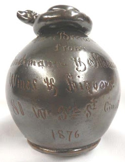
The two Albany slip jugs shown here were commissioned by Brachman & Massard from the Kirkpatricks and Anna Pottery And who were Brachman and Massard? They ran a wine and liquor wholesale and retail business that was located at 81 West Third Street in Cincinnati. The first jug, shown from three angles, features a snake that wraps around the neck of the jug and then loops out to form the handle. The incised letters in the Albany slip on the front identifies the item as a “Little Brown Jug” from the liquor dealers and bears the date 1876.
If the witness of this jug is not enough to dispel the notion of the Kirkpatrick’s temperance crusade, a second ceramic crafted for Brachman & Massard should be sufficient. Shown here in two images, this small jug carries a similar label, including identification of the company as wine and liquor dealers. But it adds a most unusual feature: At the base are incised a group of slashes that indicate 8 to 7.
The most likely interpretation is that this was the Kirkpatrick’s enigmatic reference to the Presidential Election of 1876 in which Samuel Tilden, the Democrat, received a larger popular vote than the Republican, Rutherford B. Hayes, but the electoral vote essentially was a tie. To decide which one would become President a group of five House of Representative members, five Senators and five Supreme Court Members were selected. By an 8 to 7 vote -- widely thought to have been swayed by political promises - - they determined that Hayes was the winner. The result set off a firestorm of protest as expressed in a Thomas Nast Harper’s cartoon of the time. On another snake jug the brothers emblazoned “Eight villains to seven patriots.”
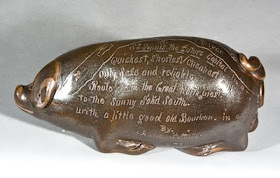
While the Kirkpatricks frequently made such political statements on their ceramics, it is clear that the brothers were not demonstrating a pro-temperance attitude by fashioning two jugs for Cincinnati liquor dealers. Or by creating a ceramic pig, shown here, that invites “a little good old Bourbon.” Rather, the symbolism of the Anna Pottery snake jugs expresses the brothers’ sardonic, highly individualistic look at the world just as they did with other ceramic objects they created.
As a postscript to the story it should be noted that Brachman & Massard went out of business sometime around 1897. The Kirkpatrick’s Anna Pottery ceramics continue to elicit great interest and one snake jug recently sold at auction for $83,650, a new record.